
Overview
Yelp is a business review site with additional features such as discounts, lists, chat, events, and social networking. I've used Yelp for years to both write and read reviews; however, it seems like the majority of people I've spoken with are more prone to take (read a review) than give (write a review). This made me wonder: Is feature creep getting in the way of Yelp's primary goal of business reviews?
To Do
Observe 4 participants interact with Yelp (web version) when given 4 specific tasks to complete.
Goal
Create new mockups to improve interface.


Actual user quotes


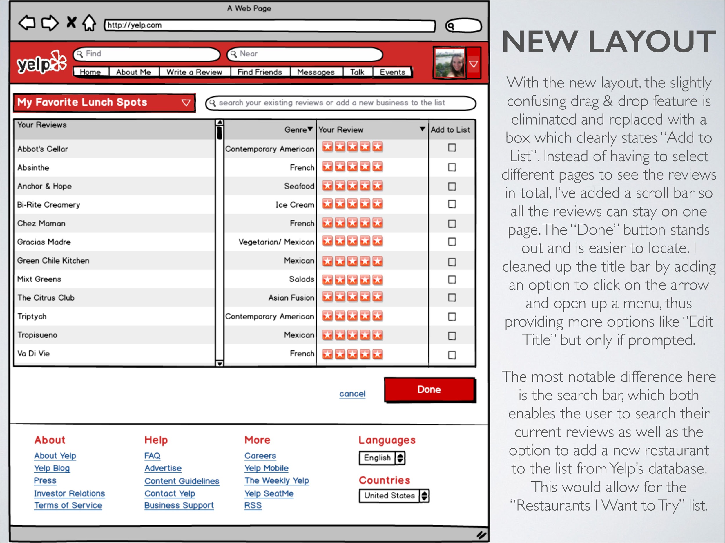
Summary
Users were able to navigate Yelp’s website but not without difficulty and complaints.
• My next step would be to usability test my mockups.
• It’s hard to make product and interface recommendations without knowing which users Yelp wants to focus on and what Yelp finds most important for their business model.
Highlights
Problem I was trying to solve
- Information overload and lack of visual hierarchy
- Lack of engagement in "Lists" feature
Improvements I made
- 85% of the users I spoke with use Yelp to read reviews, but don't write any. The more reviews there are on the site, the more accurate a business's rating becomes. My design increases engagement with a clear CTA (call to action).
- Evernote has become popular for a reason: People love to make lists! However, something tells me that Yelp's "Lists" feature hasn't proved to be a sticky feature on the site. I've improved this with the new ability to add a "Restaurants I Want to Try" list, rather than the former model of only being able to add places you've already been (and reviewed) to a list.