
OVERVIEW
Rackspace Inc. is a managed cloud computing company headquartered in San Antonio, TX, with offices around the world, including London, Sydney, Hong Kong, Singapore, San Francisco, Mexico City, and Zurich.
My initial focus at Rackspace was to improve the UX/ UI of Encore, an internal platform which thousands of "Rackers" (Rackspace employees) use everyday to help customers with their online environments. I joined the ticketing team where our mission was improving and optimizing the UX for both customers (on our external site) and Rackers (on our internal system). I've also been assisting Helix, the design system team, with implementing and organizing a new design library to standardize our patterns across platforms. Currently, I’m tackling new challenges with enormous complexity on the Billing Access and Account Management Team, working on concepts such as account consolidation, resource groups, and user and group permissions. The following is a list of just some of the problems my teams and I have been working on solving:
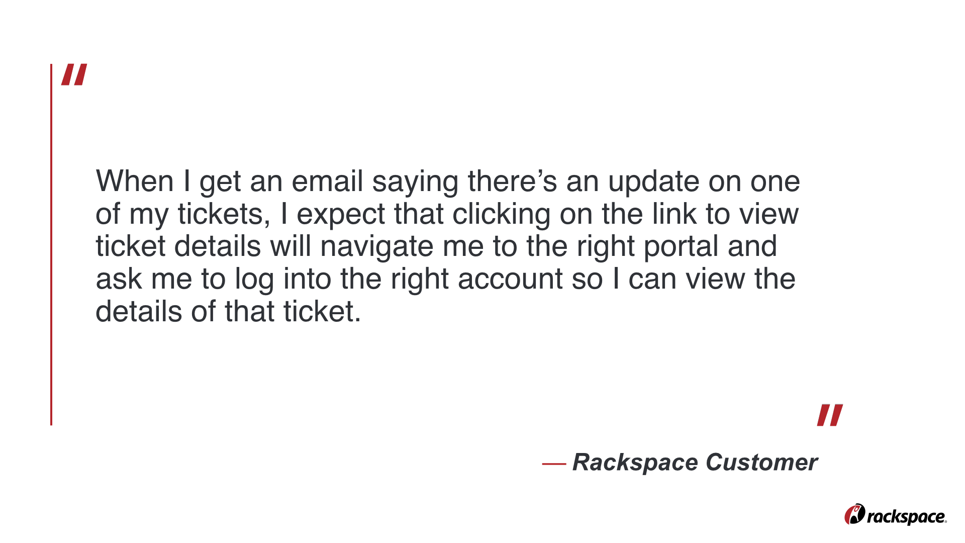
Lack of transparency during the ticket resolution process. (Customers feel like they have to call in after a ticket is submitted to make sure it's seen, or to follow-up on its progress.)
Lack of communication between products (Ticketing <-> Billing) caused by subpar APIs.
Lack of visual consistency between products (too many design languages and separate code bases).
Unnecessary page refreshes, and thereby unnecessary loading time.
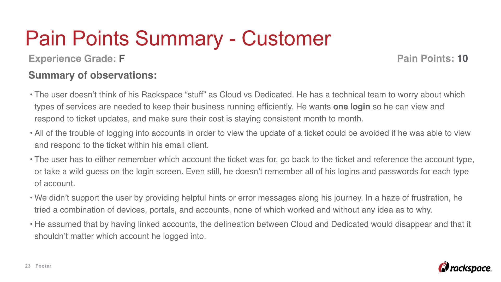
Customers' frustration of having to log in and out of each of their accounts to see all account info.
Support Rackers' frustration of having to log in and out of various internal tools in order to collect relevant information on a customer's issue.
Setting expectations up front without overwhelming the user with walls of text. If the user doesn’t feel comfortable entering into a process or flow, they’re more likely to call their Account Manager and ask them to do it. Empowering the customer to self-service, however, will save them time and let Rackspace use their resources where they’re needed most.
Forcing customers into an organization structure that isn’t intuitive for them simply because of how our backend system was created and is maintained. Customers complain about having to log in and out of each of their account types; they’d prefer to see all of their “stuff” in one place, regardless of product type.
Throughout the design process, we must keep in mind the following needs from both the user and the business:
Time to complete a task is a very important metric. We don't want to keep our customers waiting for solutions! Ticketing is the frontline for communication with our customers, and the foundation of our Fanatical Support. It's important that we make submitting, updating, and closing a ticket easy for customers and Support Rackers alike. Our goal as UX Designers on the ticketing team is to remove as many barriers as possible and provide as many contextual shortcuts as possible for each role that interacts with a ticket (there are quite a few).
Designing for our employees is different than designing for the consumer market. Our Rackers are power users because they use our platforms (Encore and CORE) 40 hours a week, and many have been with the company for several years. From early on I learned that I had to toss out everything I learned about minimalist aesthetics or progressive disclosure when it comes to designing for Rackers. They want as much information as possible on one page so they can reduce their number of clicks (and thus reduce loading time). This reinforced the need for user research and continuous user feedback.
Fanatical support is the bread and butter of Rackspace. We pride ourselves on the quality of our work and our ability to listen to customers and come up with creative solutions that solve their problems to the best of our abilities.
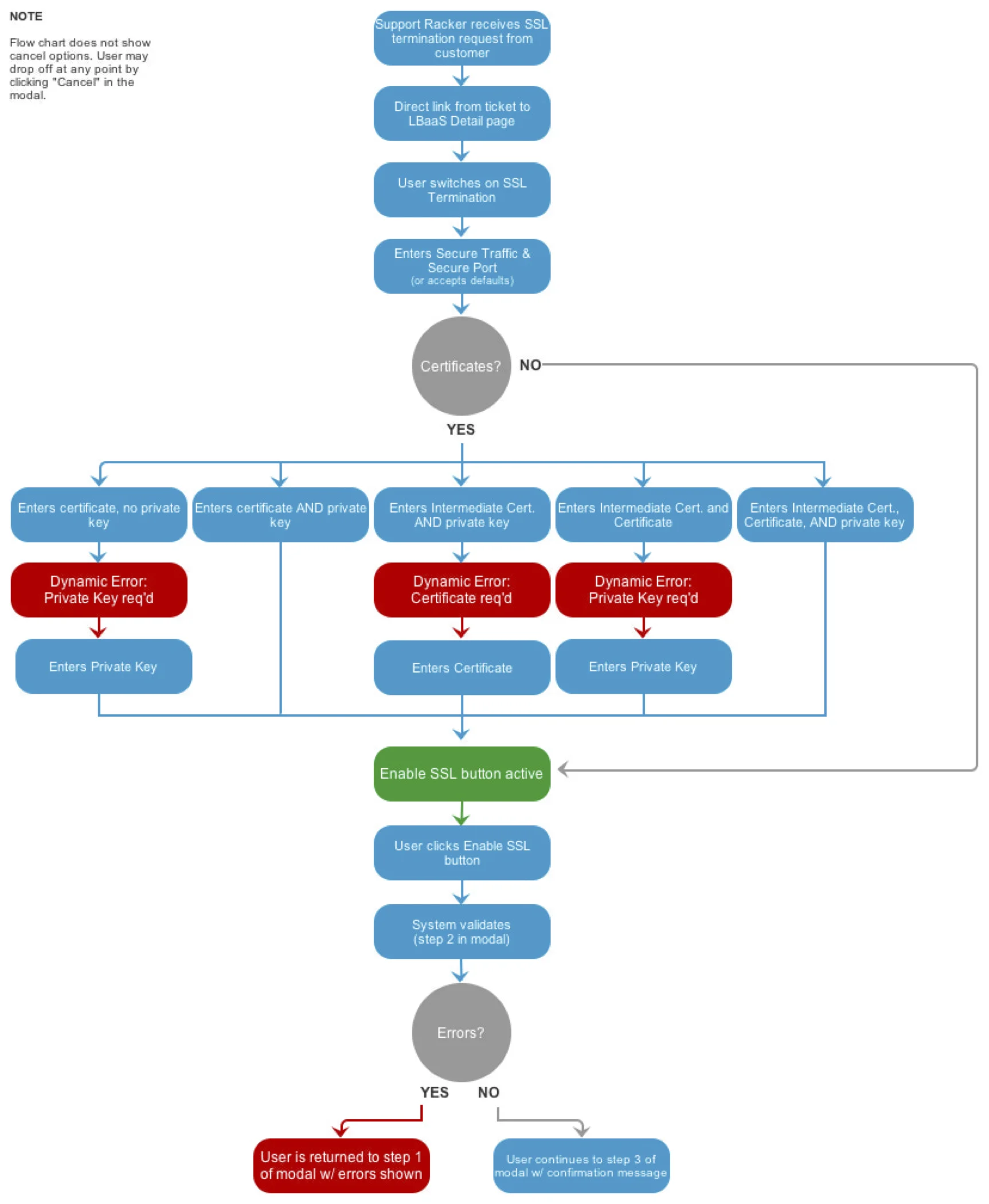
User flows
For complicated flows with multiple outcomes, I prefer to start with a user flow before getting into the design. This helps to understand the process from a high level and also to establish how many screens are needed. Below is an example of an SSL Termination flow:
2. Sketches
Some quick sketches to get my ideas on paper before investing time in creating anything of higher fidelity.
3. High fidelity mockups
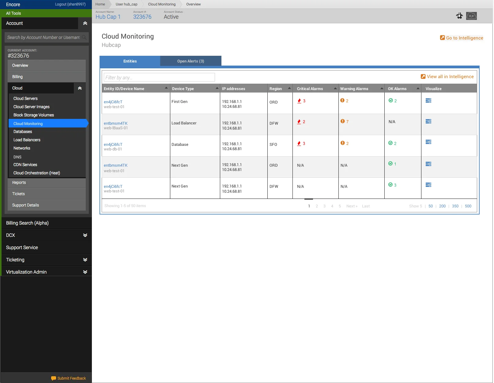
An example of a Cloud Monitoring page I designed within the Encore platform. Stakeholders on the team insisted on linking from one platform, Encore, to another one of our platforms, Intelligence. I decided to prototype this to show how disjointed the experience would be if we went ahead with this decision, especially because each platform has it's own design language. This led to the team deciding that we were better holding off until we could keep all actions within Encore. Sometimes you prototype to communicate the ideal experience; other times you prototype to communicate the type of experience you want to avoid. (Credit to Tom Greever's book "Articulating Design Desicions" for helping me understand more about communicating - and sometimes even selling - these types of design ideas.)
Interactive prototype: https://invis.io/BF6HX0IYP
I really enjoyed teaching myself how to prototype in the browser (using CSS) to save time recreating these mockups. This is our legacy design language, and one in which we didn't have an easily accessible library to pull from.
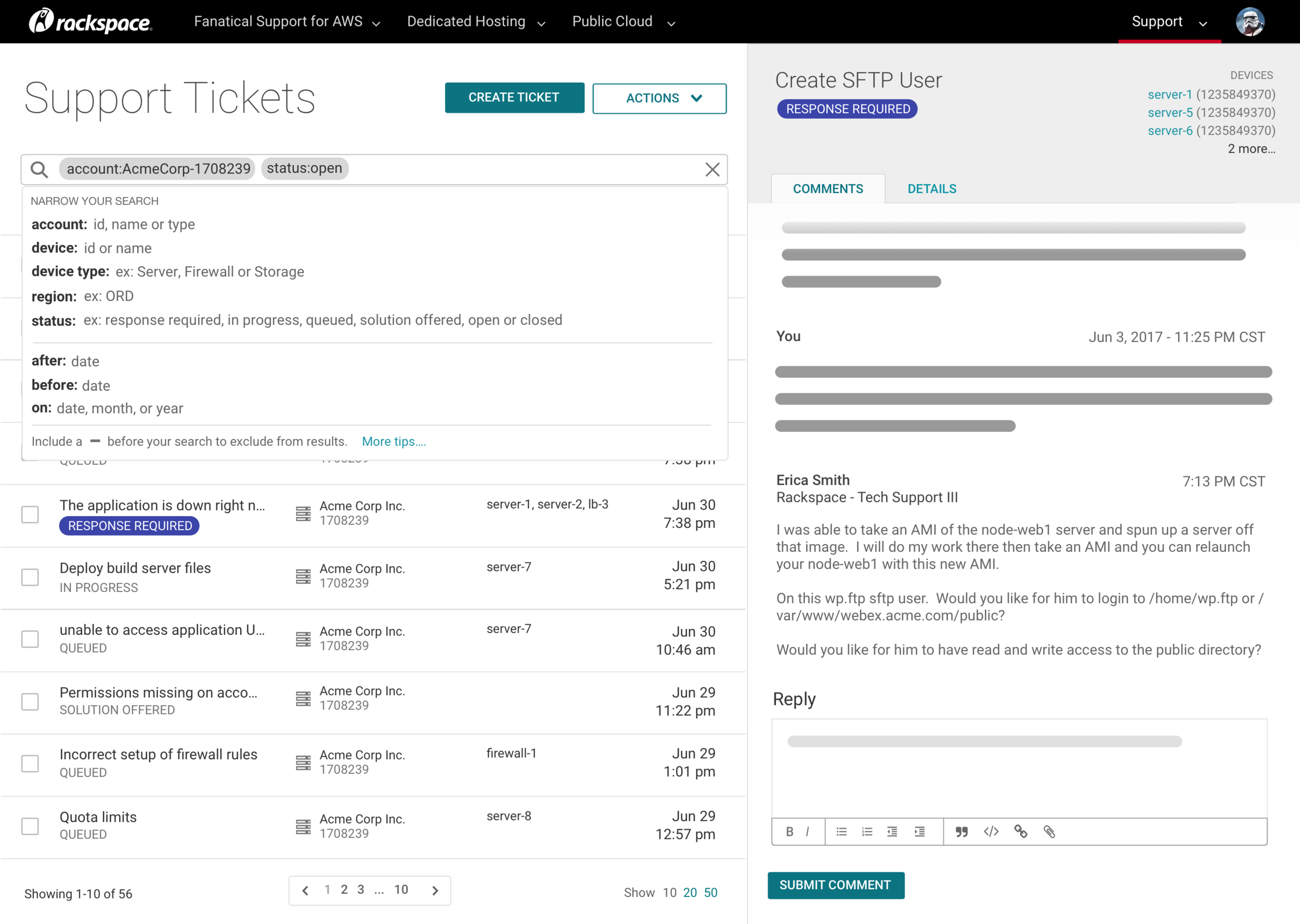
Using our company's new design system, my team designed a new UI for the customer-facing Support Tickets page. Shown below is a new feature we proposed: guided search (which luckily tested really well with customers). We were excited to use guided search because it declutters the page from the current implementation, which lists all filters in a column on the lefthand side of the ticket list. Guided search also serves another problem: During user research sessions, we've heard customers describe our platform as "outdated", which told us that our goal as designers are not only to make the interactions more intuitive, but also to represent the direction of the company which we want to project as forward-thinking.
Also in this concept, we introduced the parent/ child layout as shown below, which was driven by customer feedback that it was inconvenient to click into each ticket individually, wait for a new page load, only to sometimes read a message from Rackspace that said, "Thanks for submitting a ticket! We'll get back to you ASAP." (paraphrased). We are currently cataloging the types of information that can be included in a ticket (code snippets, for example) and whether or not this is enough space for those use cases. One option I proposed is to allow the user to pop out the ticket into a separate browser tab, but we are undergoing research to see if this is a problem that needs to be addressed at all.
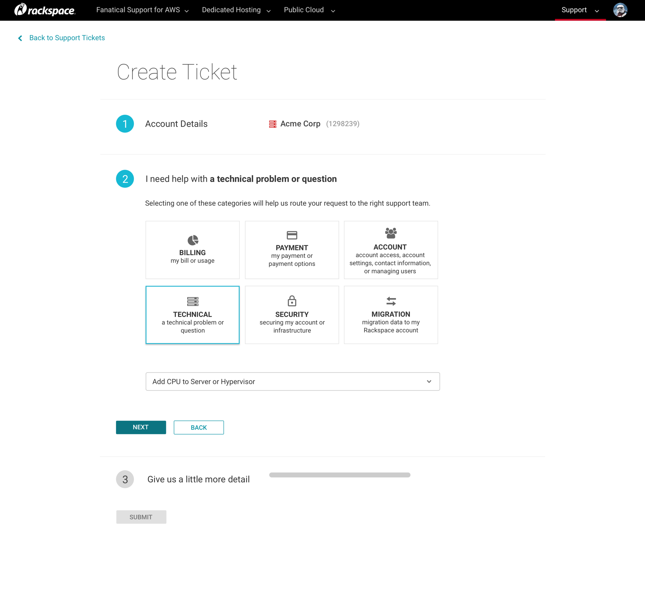
Another need for our customers is creating a new support ticket. My team and I explored ideas for breaking up the long form during this process. Why is that important? The more information we can collect up front, the less back-and-forth there will be between the customer and the Rackspace Support Tech. It's a little bit of an investment, but our assumption is that this will lead to quicker resolution time and better internal routing. We were concerned about overwhelming the user by asking for so much information up front, so we decided to break up the form into 3 steps, and we used various selectors thoughtfully that made sense for each form of data required. Using a combination of tables, choice tiles, drop down menus, and text fields not only breaks up the initial perceived monotony of the form, but also presents each set of information in a way that makes sense for the types of elements it contains (icons, a few words, longer explanation text, etc).
4. Wireframing: interactions
Low fidelity concept work for the future state of Encore, experimenting with panels.
5. Building a design system
Toast Notifications was one of the 10+ components I was responsible for creating and defining. The template, created by the design system team, includes an overview of the component, how to use it, how NOT to use it, best practices, visual design (including measurements, spacing, color, and font specifications), interactions, animations, and contextual use with other components and on various screen sizes.
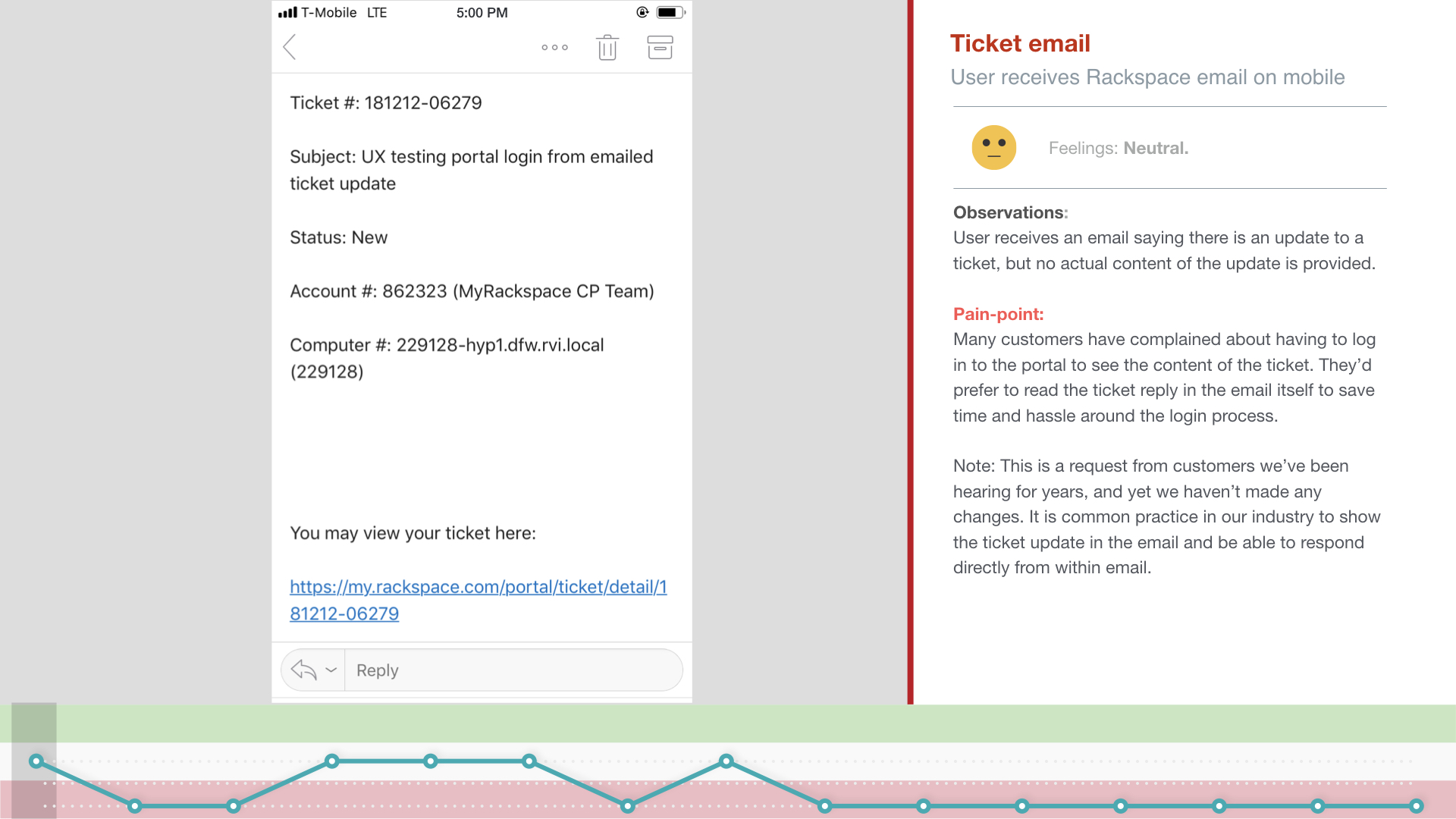
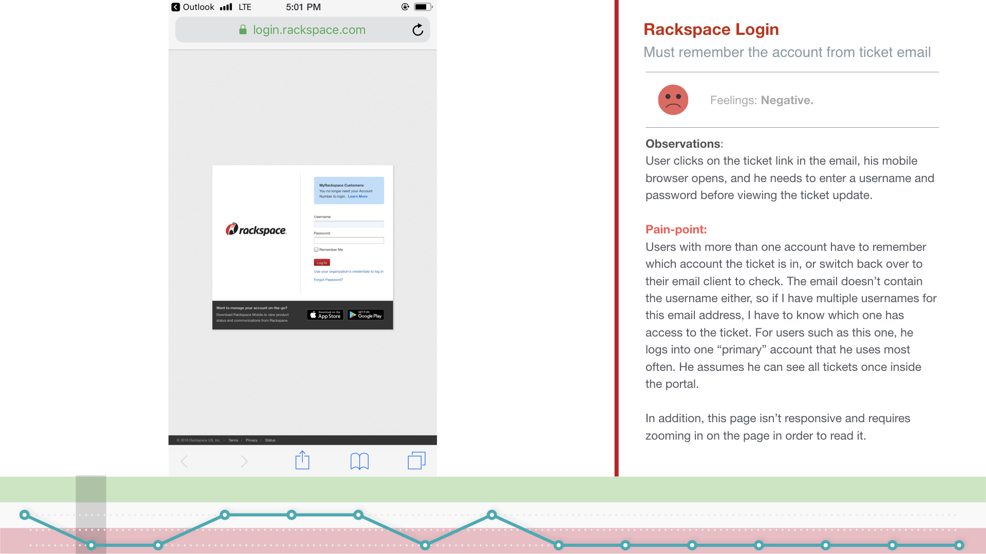
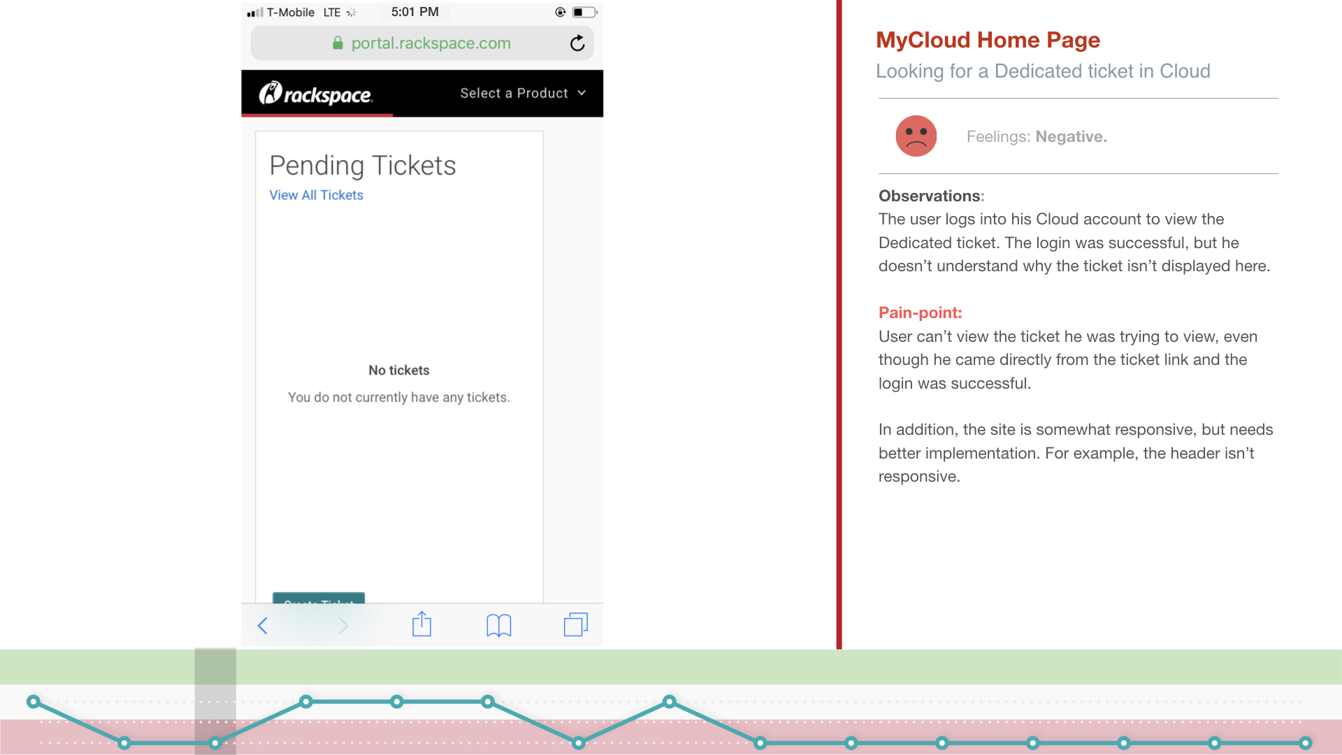
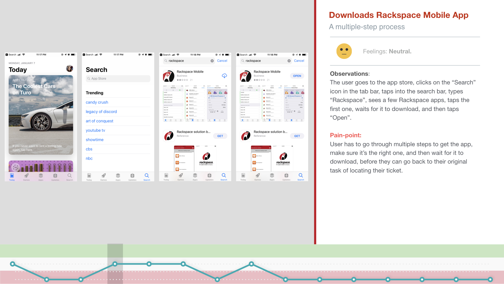
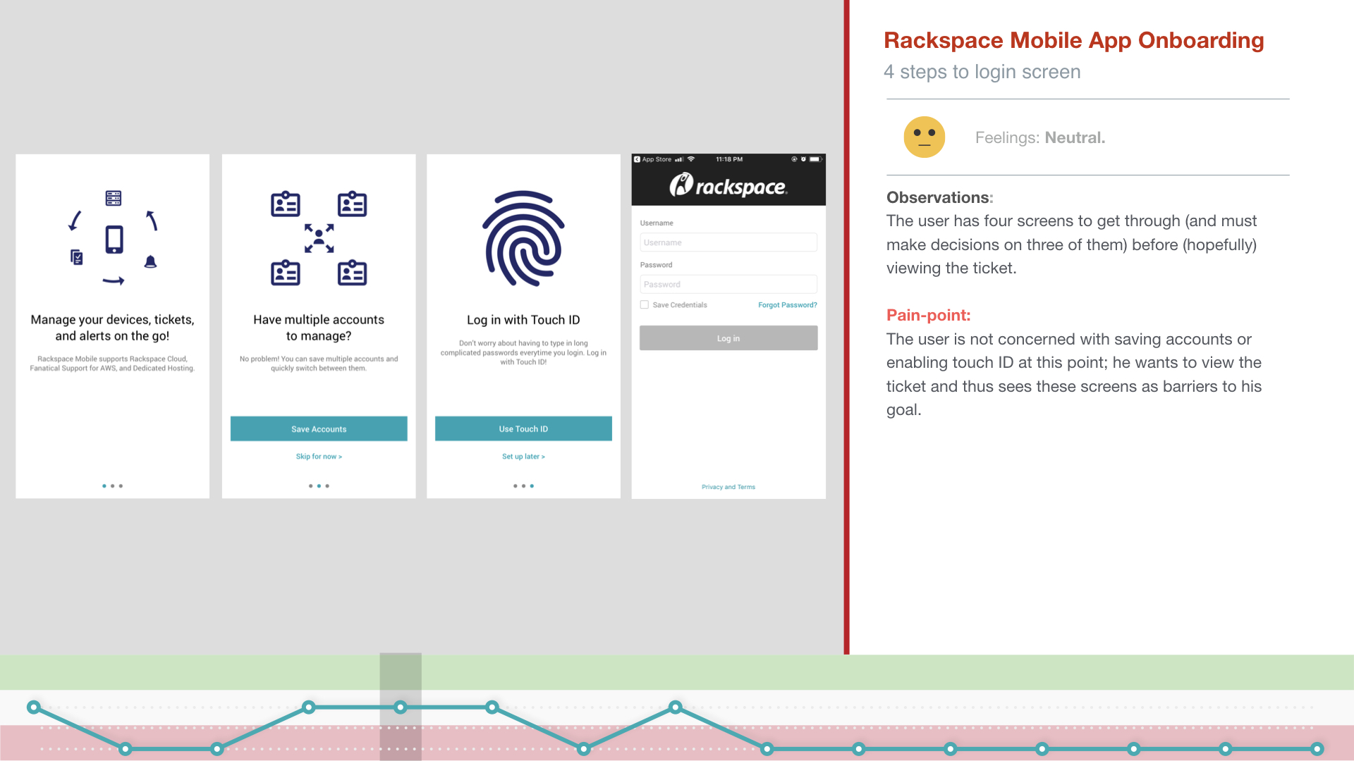
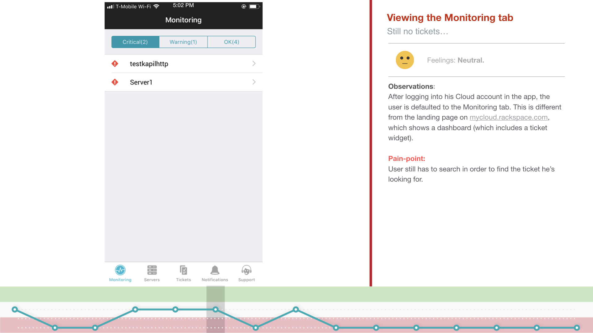
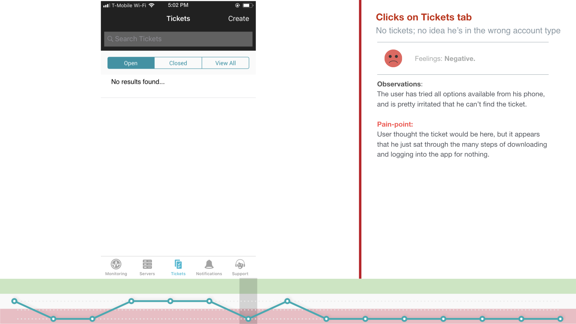
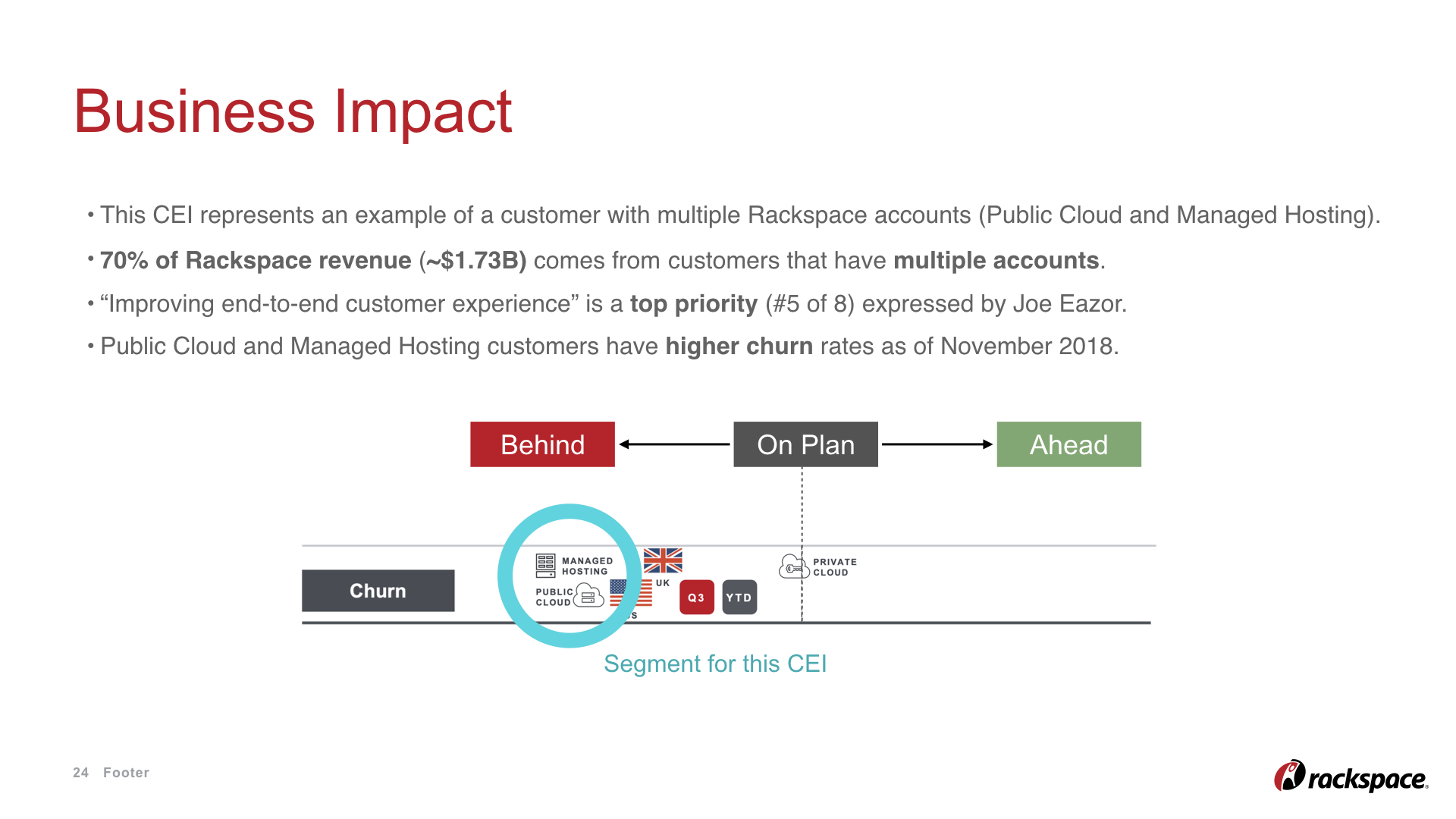
CASE STUDY 1: Customer Experience Index
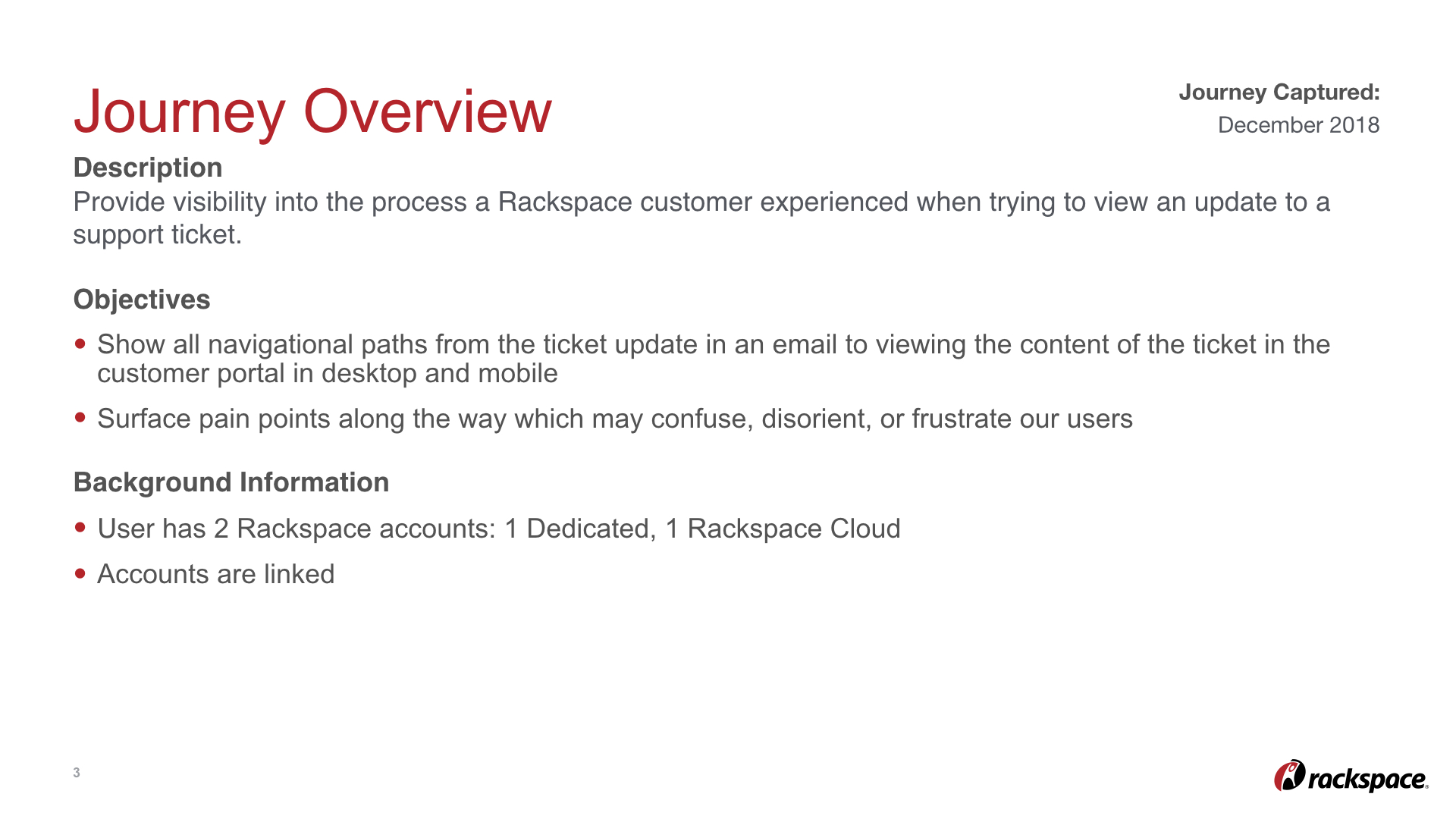
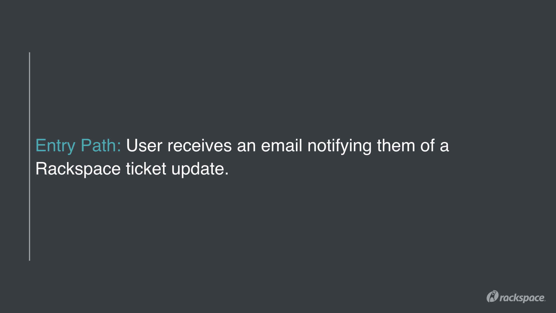
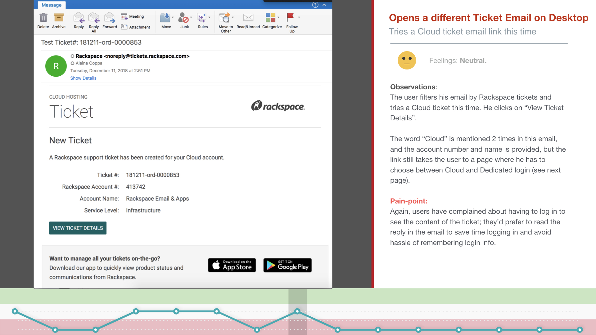
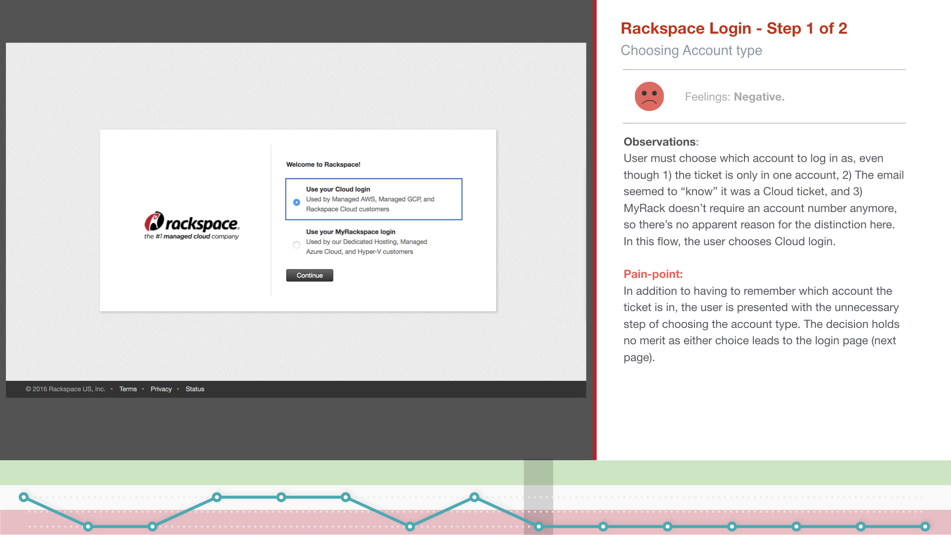
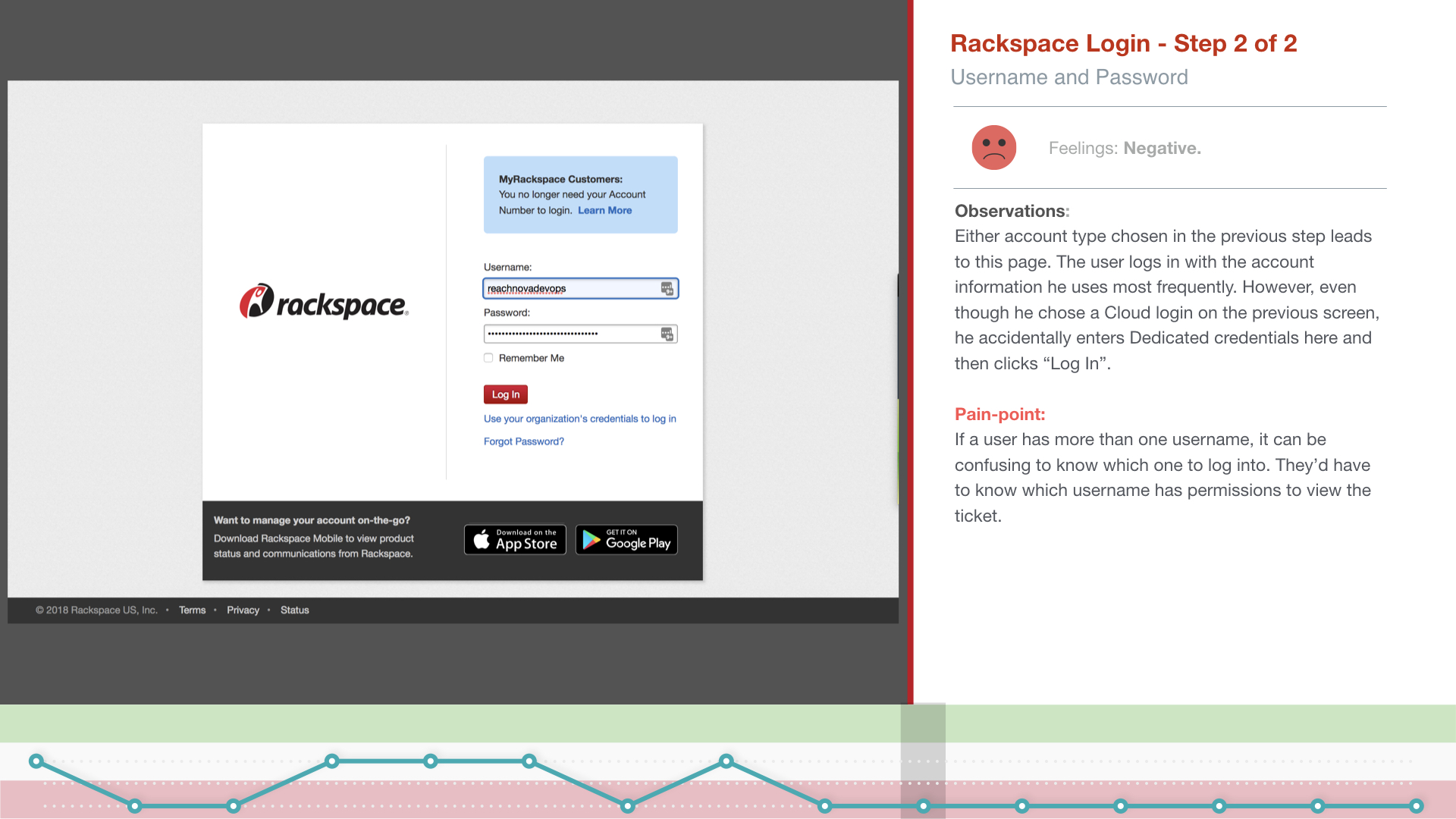
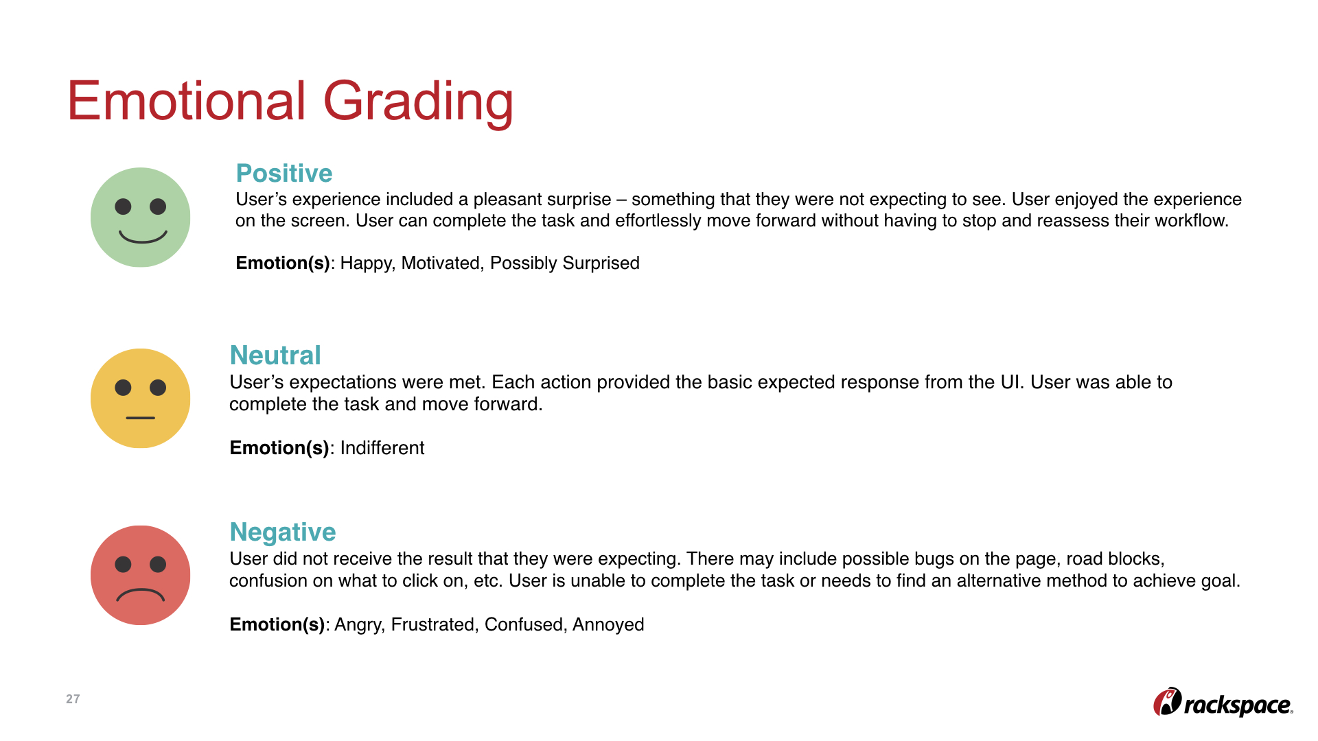
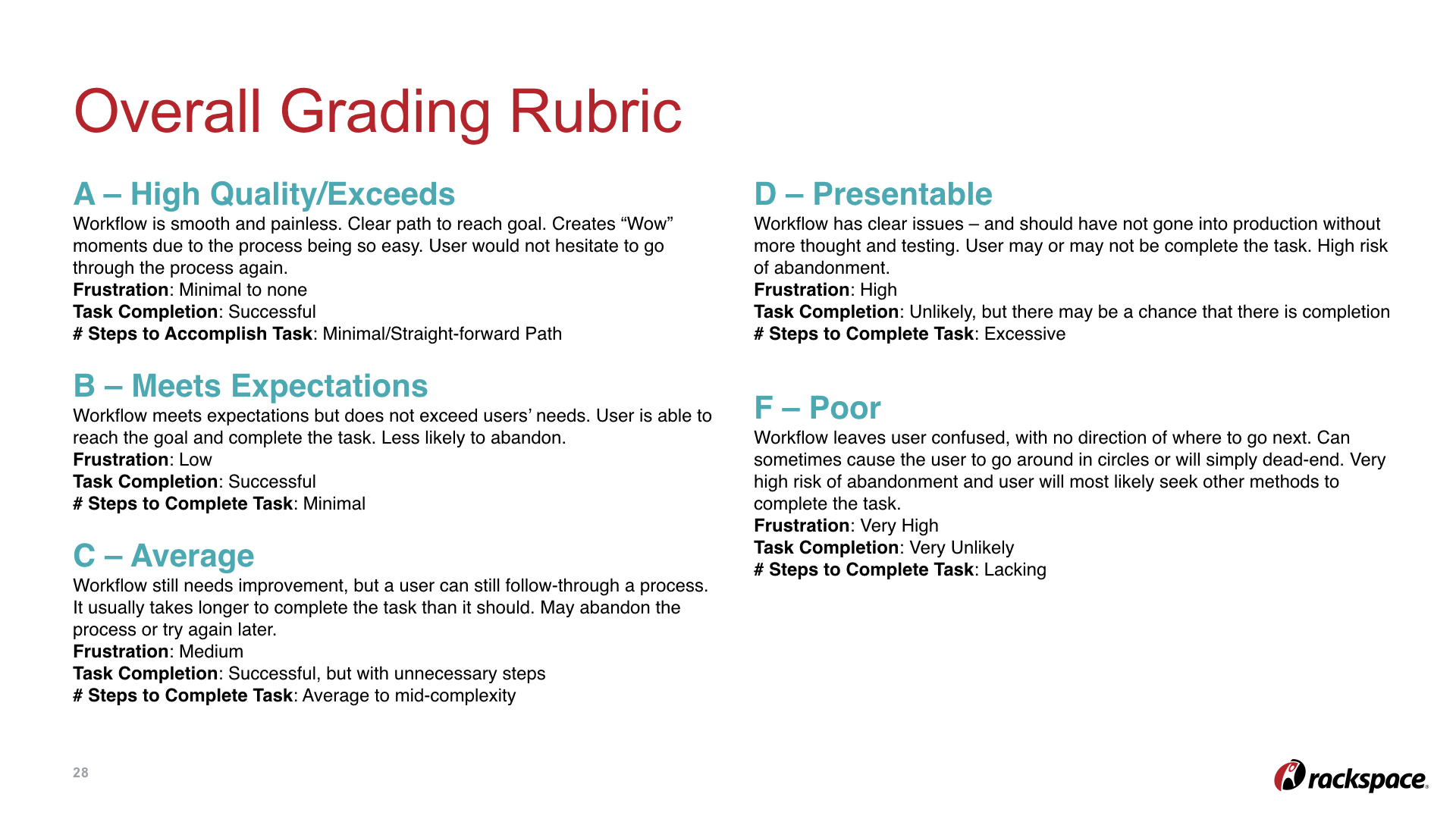
One of the most effective ways we’ve found of communicating our customer pain points to the larger team is through CEIs, or Customer Experience Indexes. They’re essentially like Journey Maps; you take a scenario and walk step-by-step through the user flow, highlighting the emotion at each step of the way. CEIs, however, are a bit more robust than journey maps because of the format, which allows the viewer to take in each step at a time, go into more depth within each step, and include things like business impact and next steps as slides towards the end, which seems to be a perfect language to use when sharing with senior level managers.
HIGHLIGHTS
IMPROVEMENTS MADE so far (in progress)
Lowered cognitive overhead with more relevant UI elements (e.g. replacing radio buttons with drop down menus) and improved workflows (replacing a page with a modal to avoid taking the user out of context of their current task)
Shortened average time to complete a task with improved UI elements (e.g. modals load faster than a page load where multiple API calls are required) and a clearer visual hierarchy
Facilitating more ongoing user research so we can iterate and improve our designs more quickly
Continuously contributing to the process of consolidating tools and accounts - a huge pain point for users
Contributed to the process of documenting and defining our new design language for a consistent brand experience and faster cognitive processing driven by more intuitive elements and navigation
Continuously exploring new concepts to keep challenging ourselves and pushing new boundaries, such as dashboards as a home page and hub-and-spoke model for both Rackers and customers
Increased NPS scores through the implementation of UX and UI elements discussed above
Aided in a report of Racker roles by way of an in-depth user research study, followed by multiple presentations communicating these findings to PMs and managers throughout the organization
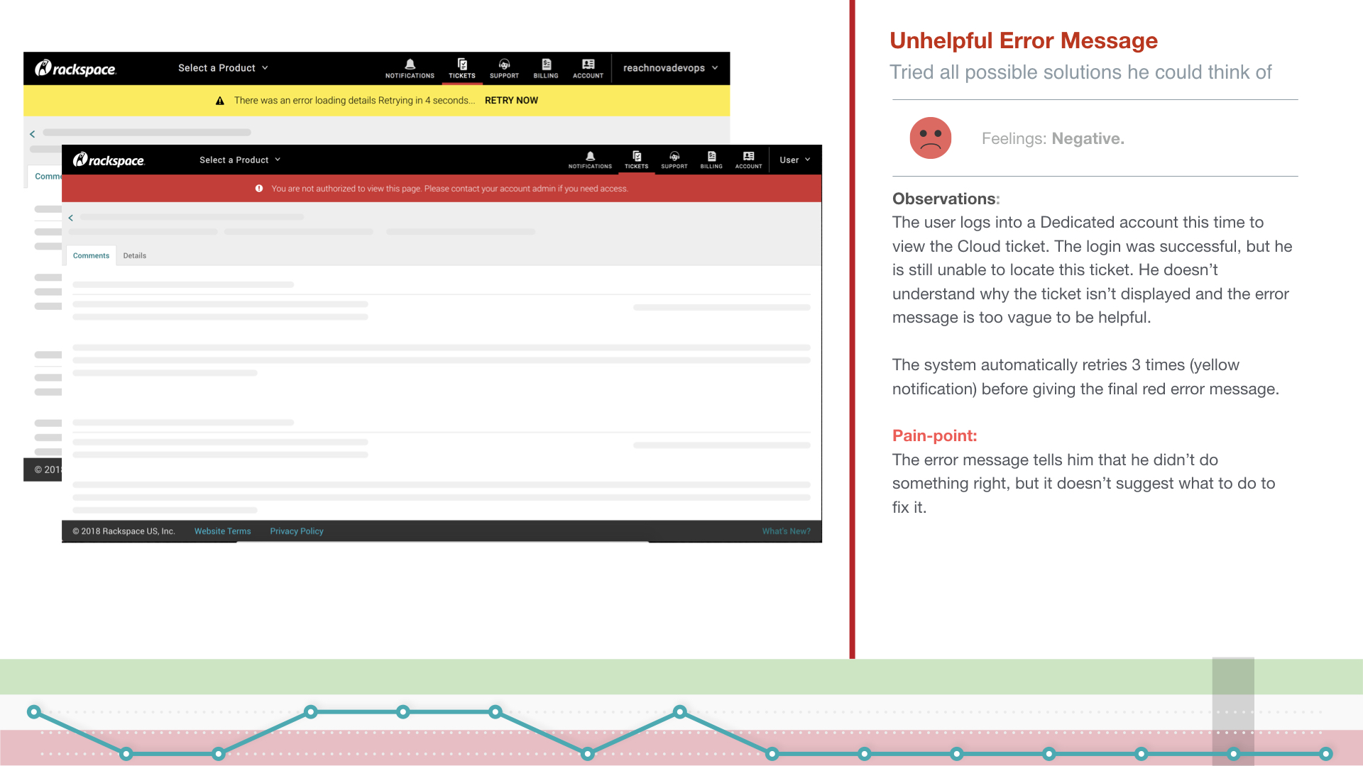
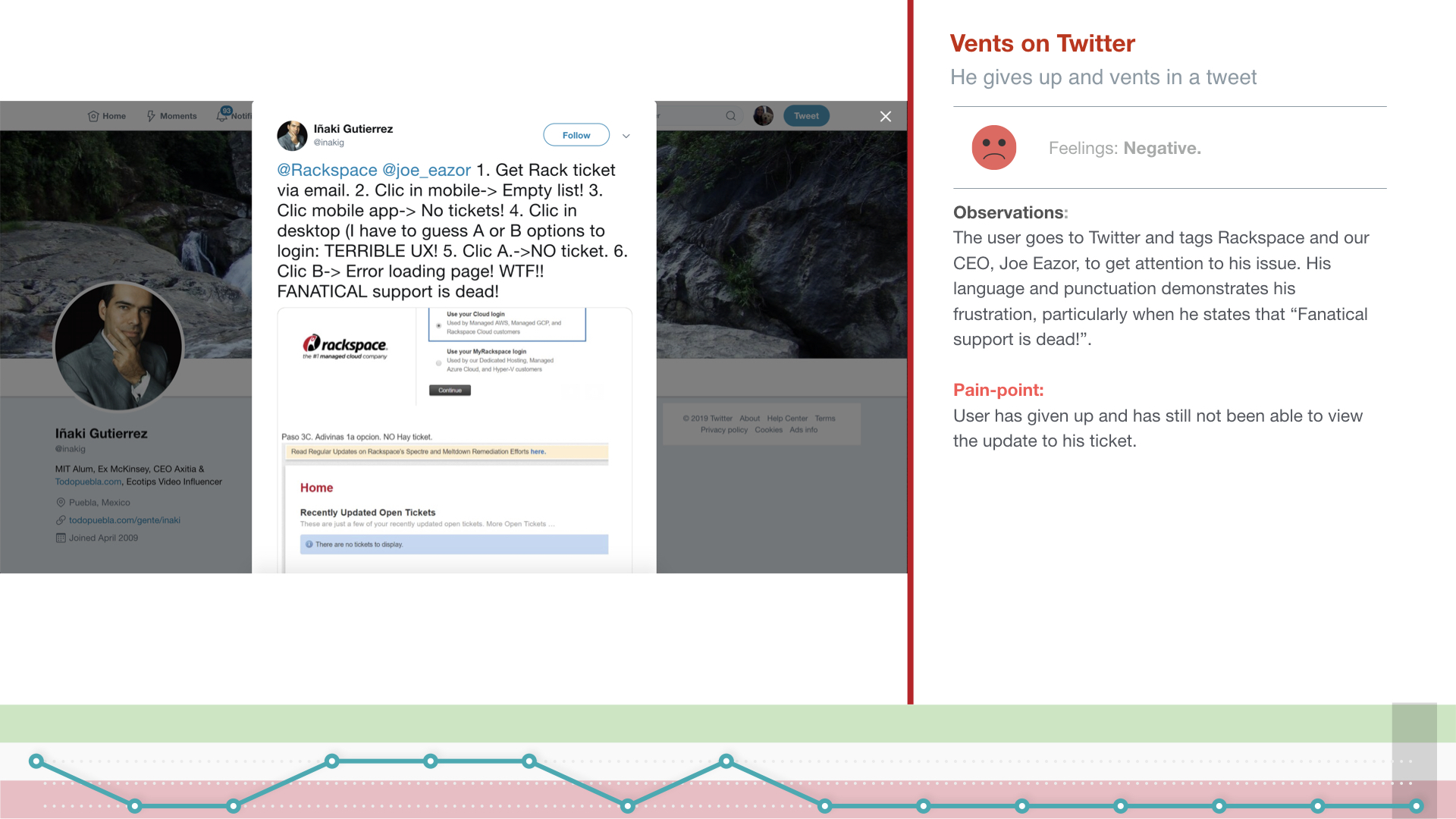
Helped users find appropriate solutions to correct errors and help them understood how to avoid them in the future
CASE STUDY 2: Project Spotlight: Navigation & IA Redesign
late 2018 - present
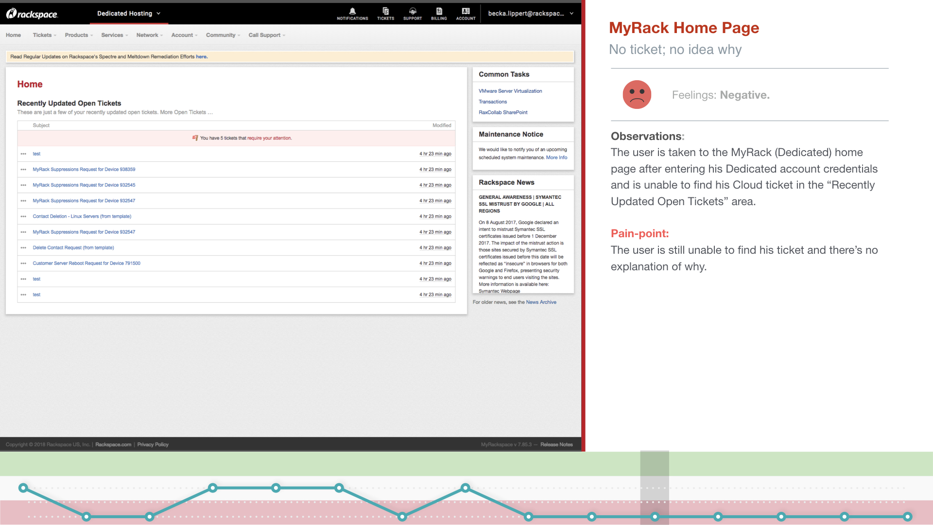
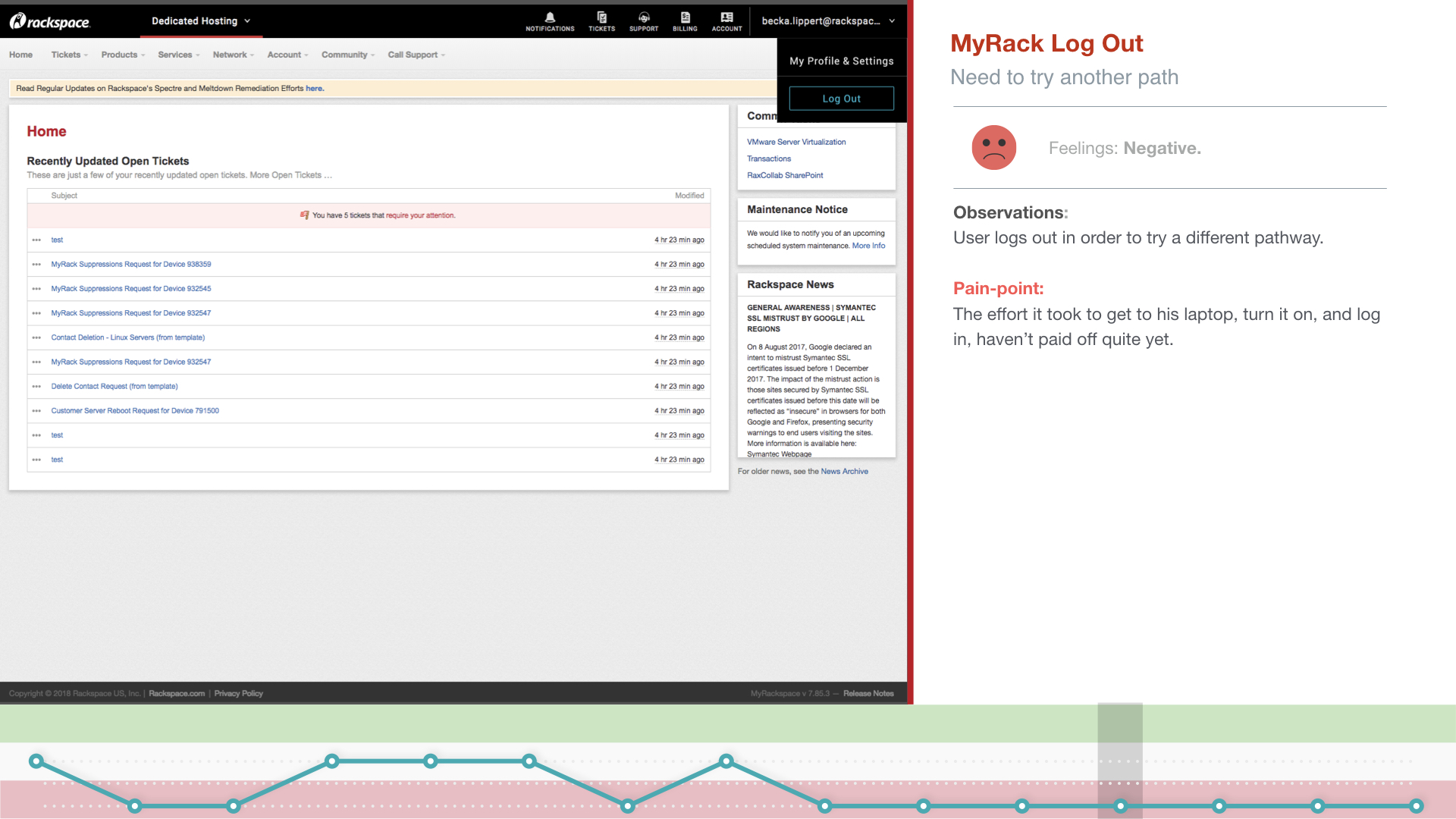
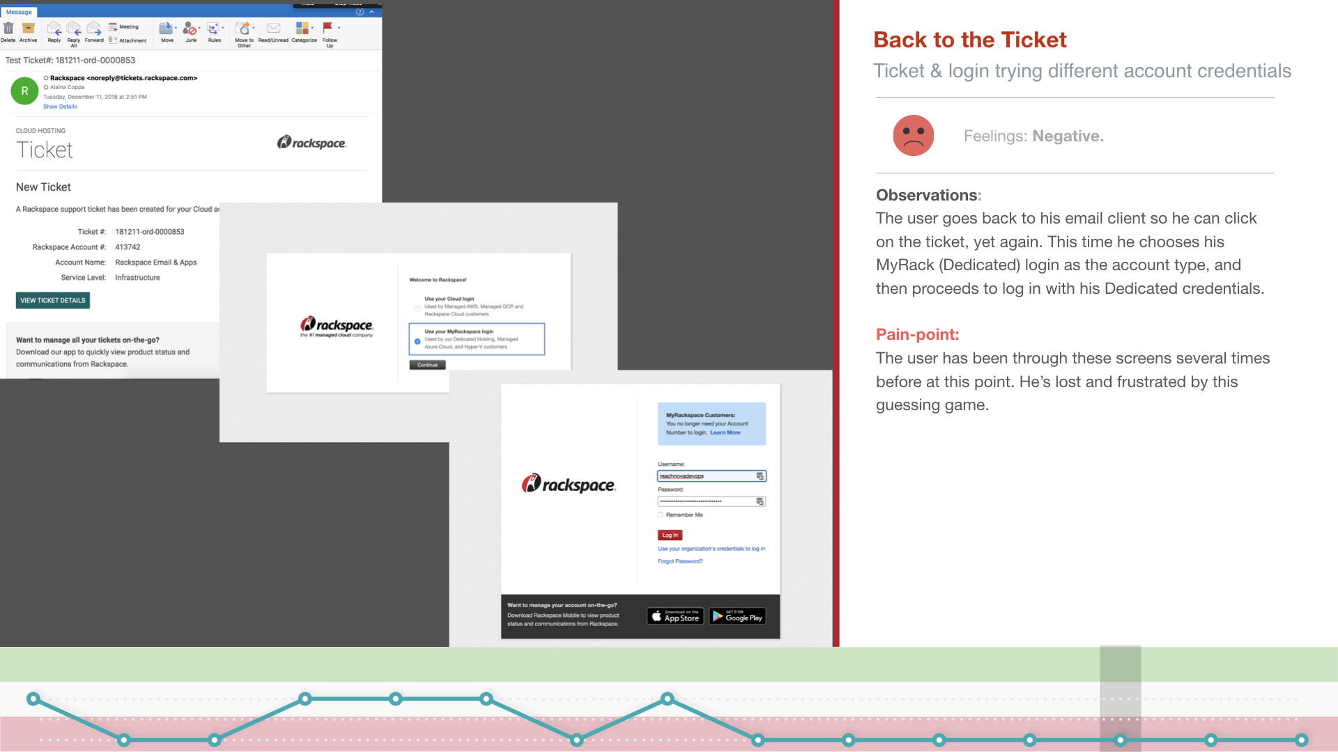
Currently, Rackspace customers have to log in and out of different accounts and different portals to access all of their information and infrastructure. Along with another designer, I’ve been asked to redesign the lackluster siloed experience into a future-state ideal experience where customers can log into one portal to see all of their stuff in one place.

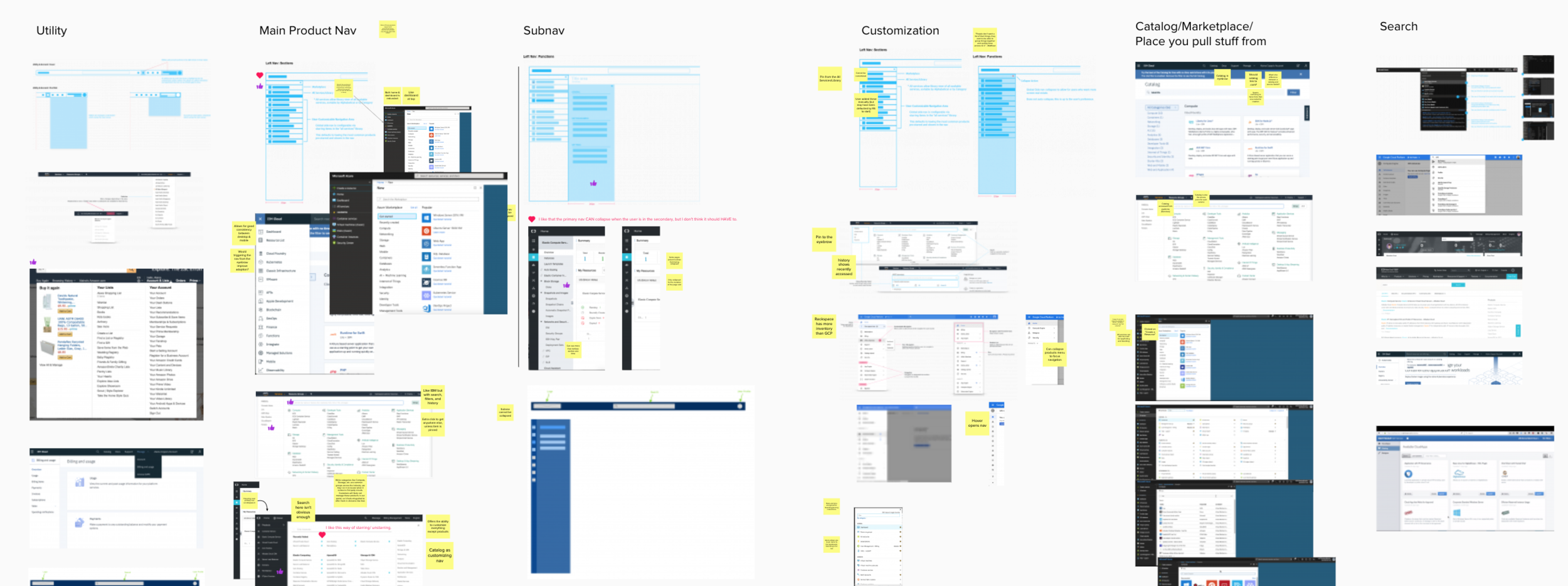
Problem to solve: Many portals, many different navigation menus, each with their own IA. (Believe it or not, there are even more portals not shown here!)
Phase 1 | what do we already know? what questions do we have?
The first step in this project was to identify what assets we already had on the topic of navigation and IA. The idea of combining our portals into one has been thrown around for years, so we didn’t want to lose the information and designs from those previous conversations. We dug through old research findings, design files, InVision prototypes, and Mural boards and extracted information that was still relevant. We met with stakeholders and laid the foundation for the beast of a project before us. We asked and answered questions like, “What is our success criteria?” and “Who are we designing this for?”. We wrote out the problems we’re solving, business goals, user stories, questions we want to answer, and “how might we”s. We looked over past design concepts, and ideated on new ones. We met with our manager, design director, and the research team several times to share our roadmap for next steps.
Single source of truth for all wireframes previously created and industry best practice screenshots, organized by focus area or component
Phase 2 | Information architecture
The task of combining and organizing the information architecture between each portal is a complex one, so we started with an audit of each portal, then moved into an affinity diagram exercise, and then user testing to see a) if customers understand all of the terms and b) how customers would organize and categorize everything when it’s combined.
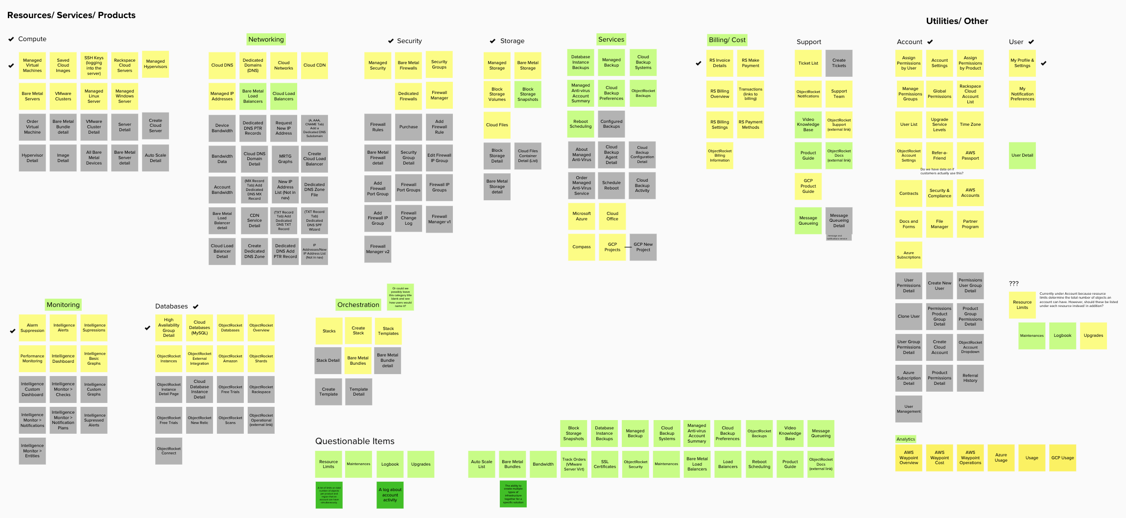
Affinity Diagram
Phase 3 | navigation presentation and ui
We evaluated and boiled down down allllll of the design concepts into a few of the best, and will be testing those concepts and other component interactions (such as search functionality, which we’ll be adding to our navigation menu as part of this project). The following is an overview of our proposal, including some of the elements we'll be testing in Phase 3 (and future phases to account for design iterations):

Phase 4
Designs showing incremental changes we can make and put on a realistic roadmap in order to get to the final state. Showing manageable steps will help us get buy-in from the development team, who we don’t want to overwhelm with the technical implications of the future state design. Therefore, we’ve started making designs for V1 which will be one (bite sized) step towards the ideal solution.

One screen from our V1 navigation consolidation project. We expect there to be about 5 versions in total before the ideal end state can be realistically implemented.
Note: UX Design is more than just sketching and pretty mockups. There are other, less visually stimulating artifacts in the form of Excel docs (for inventory analyses) and Word docs (for user research scripts and survey questions). The information in these documents is proprietary but I'm happy to discuss the incorporation of these elements in context of a project.