OVERVIEW
As Senior Product Designer on GitLab’s Secure section, I lead UX for Security Insights, which encompasses all things Vulnerability and Dependency Management, Policies, Compliance, Scanner Configuration, Security Profiles, Governance, and Reporting. My strength is designing by workflow across multiple personas (developers, AppSec engineers, compliance officers, CISOs) rather than screen by screen, with a consistent eye toward business impact: learnability, tier upgrade nudges, feature discoverability, and AI enablement. I work closely with my PM on product roadmaps and strategy, and with my engineering team on technical feasibility and merge request reviews to ensure the implementation matches the design specs.
I also contribute to GitLab's Pajamas Design System, defining and maintaining components in Figma and at design.gitlab.com.
GitLab consistently invests in security and compliance as the driver for the majority of our Ultimate accounts (the highest paid tier). Secure features account for nearly 50% of GitLab revenue, so we are, and should be, held to a high standard.
HIGHLIGHTS at GitLab
The following were initiatives or projects I’m particularly proud of:
Whenever I see opportunities for process improvements in the way we work, I open up a Merge Request to propose a change to the our company handbook (which is open to the public and referenced internally several times a day). Here’s an example of an improvement I proposed to how TAMs (Technical Account Managers) interact with the Product team.
I created a performance feedback survey so that my team could give me continuous anonymous feedback on my performance, so I don’t have to wait for our annual 360 reviews to address any areas of improvement.
I’ve received three discretionary bonuses, through nominations by my peers. Discretionary bonuses are rewarded when a team member goes above and beyond the expectations of their role. The peers that nominated me spanned a range of roles I collaborate closely with; the first nomination came from my Technical Writer, the second from my Product Manager, and the third from a fellow Sr Product Designer I supported on an important initiative - a walkthrough showcasing vision designs at a GitLab Epic Conference, presented by our Chief Product Officer.
CASE STUDY 1: Security Dashboard refresh
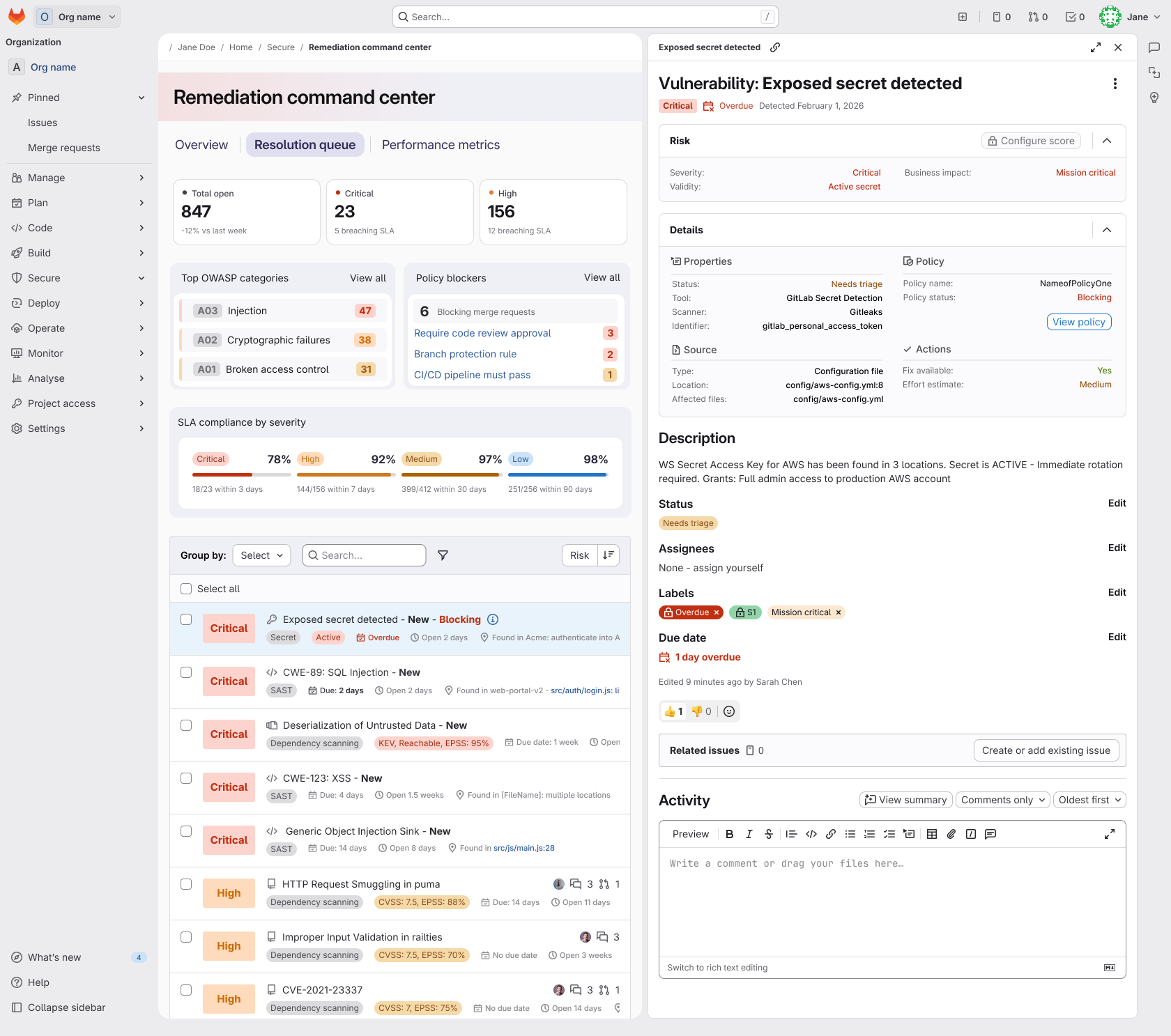
A design leadership story about turning a legacy dashboard into clearer, more scalable security insights across the organization. I led the UX strategy for a high-visibility security dashboard refresh by turning ambiguous customer pain points into a validated roadmap, aligning cross-functional partners around scalable design decisions, and helping ship a dashboard experience that materially increased adoption.
‼️ Problem to solve
The project started with a clear product gap.
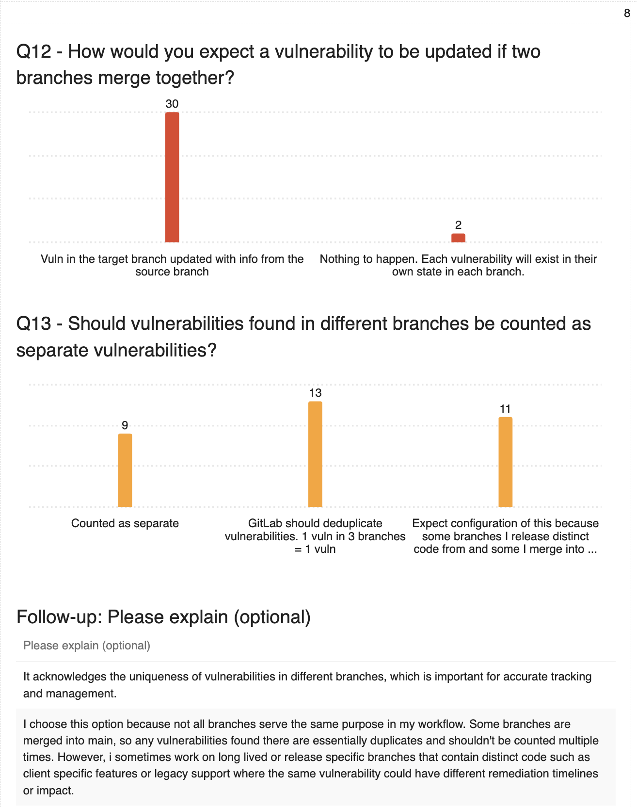
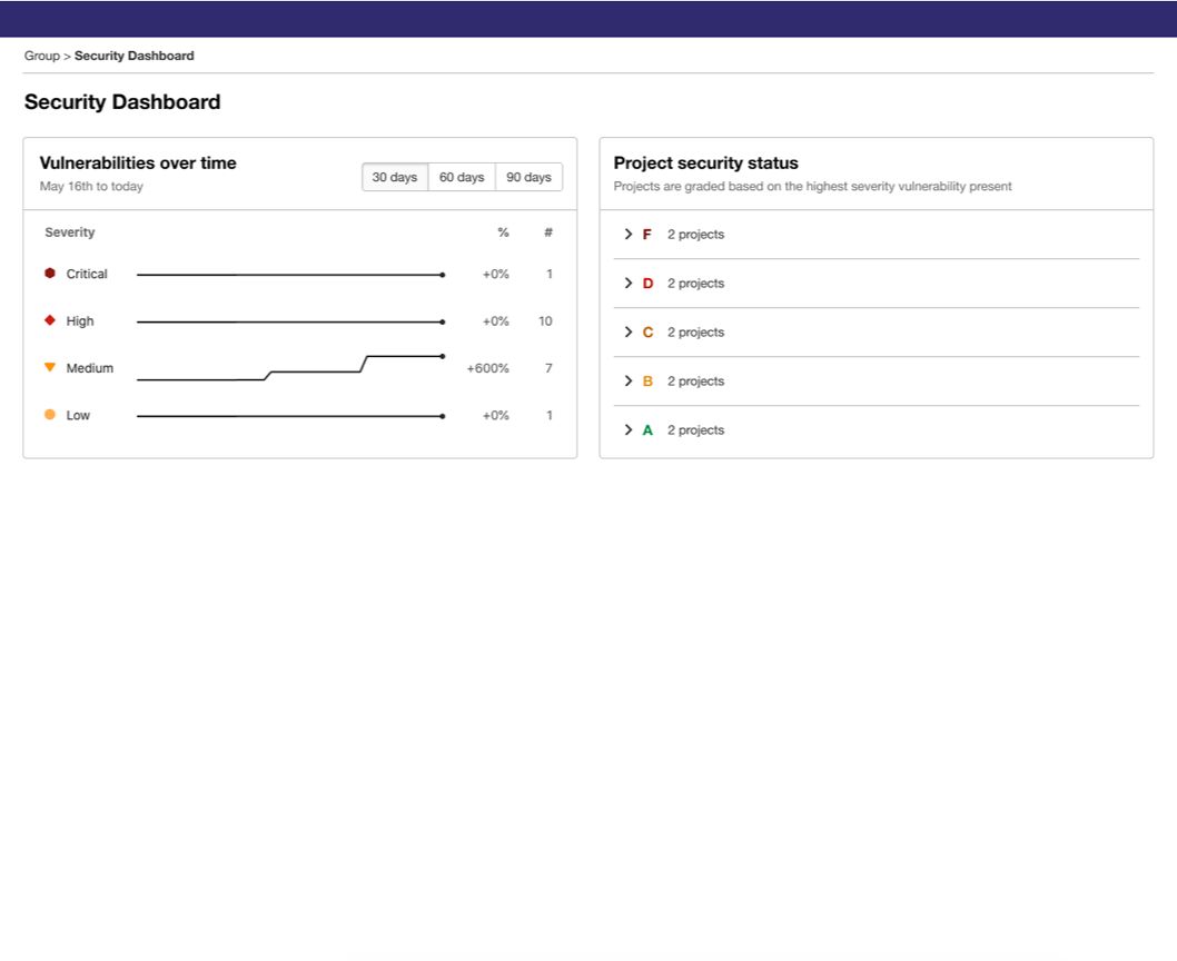
In 2024, customer research showed the existing Security Dashboard was not meeting the needs of AppSec engineers or leadership for prioritization, reporting, and trend visibility,
Customers wanted more than severity counts: they asked for better visualization, drill-down paths, remediation context, and visibility across branches and releases. They were using GitLab security scanning and vulnerability management features, but most customers were exporting their reporting insights into an external analytics tool. Not a great look for “The One DevOps Platform" company whose core value proposition is being a single, end-to-end application designed to replace disjointed, "do-it-yourself" toolchains.
This created the case for a dashboard refresh centered on helping users identify risk and visualize trends.
📆 Timeline
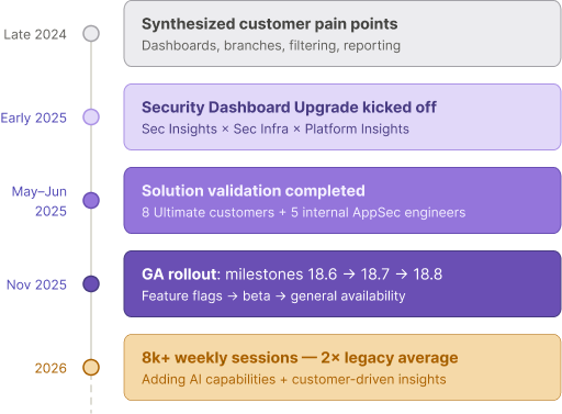
UX had a runway while the backend team prepped for the new dashboard functionality, so we were able to conduct a few validation and iteration cycles.
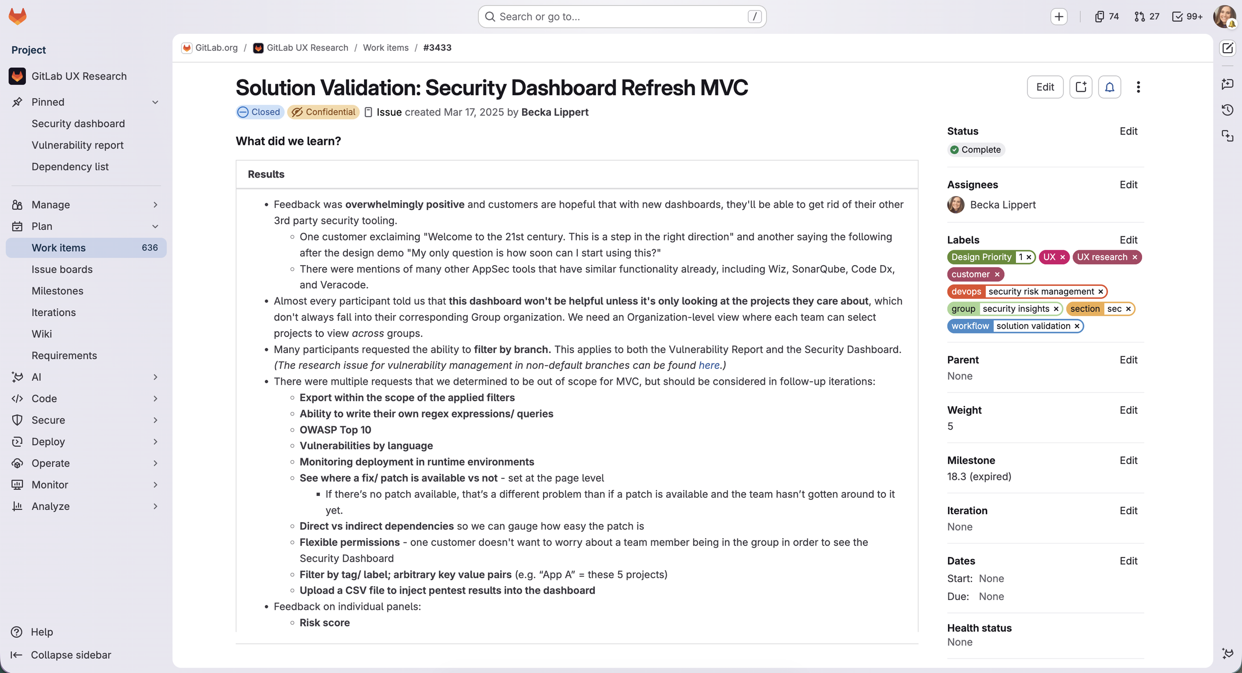
After collecting feedback on a few early prototypes, I documented all research findings in a GitLab work item (our Single Source of Truth). Work items live within a parent epic, which houses all related design and development work items.
✅ Considerations & Decisions
PRODUCT
Throughout this project, the team transitioned through three PMs (the original PM, an interim PM, and the new PM), so I had to take the reins with a consistent product strategy. I shifted the focus of the legacy dashboard from severity snapshots to a new focus of prioritization and remediation (for developers) and reporting (for leadership). I turned what was formerly a a status page into the beginning of a holistic workflow. I translated customer and market pain into a focused design story for Security Insights and communicated that to team members - new and existing - for internal alignment. The primary use cases were:What’s on fire? What needs my attention most in this moment? AppSec engineers are looking for help triaging the highest severity, reachable, exploitable, true positive risk first, rather than cherry picking vulnerabilities one by one as they are detected. A high-level dashboard is a perfect place to help identify where they can have the biggest impact in the shortest amount of time.
Is our AppSec program effective? Leadership wants insights into how effective and successful the current security program is at scale. They need to know if they need to allocate more resources in this area, where they could have the most impact with developer security training, and start to make correlations about what’s working, what’s not, and why.
DESIGN
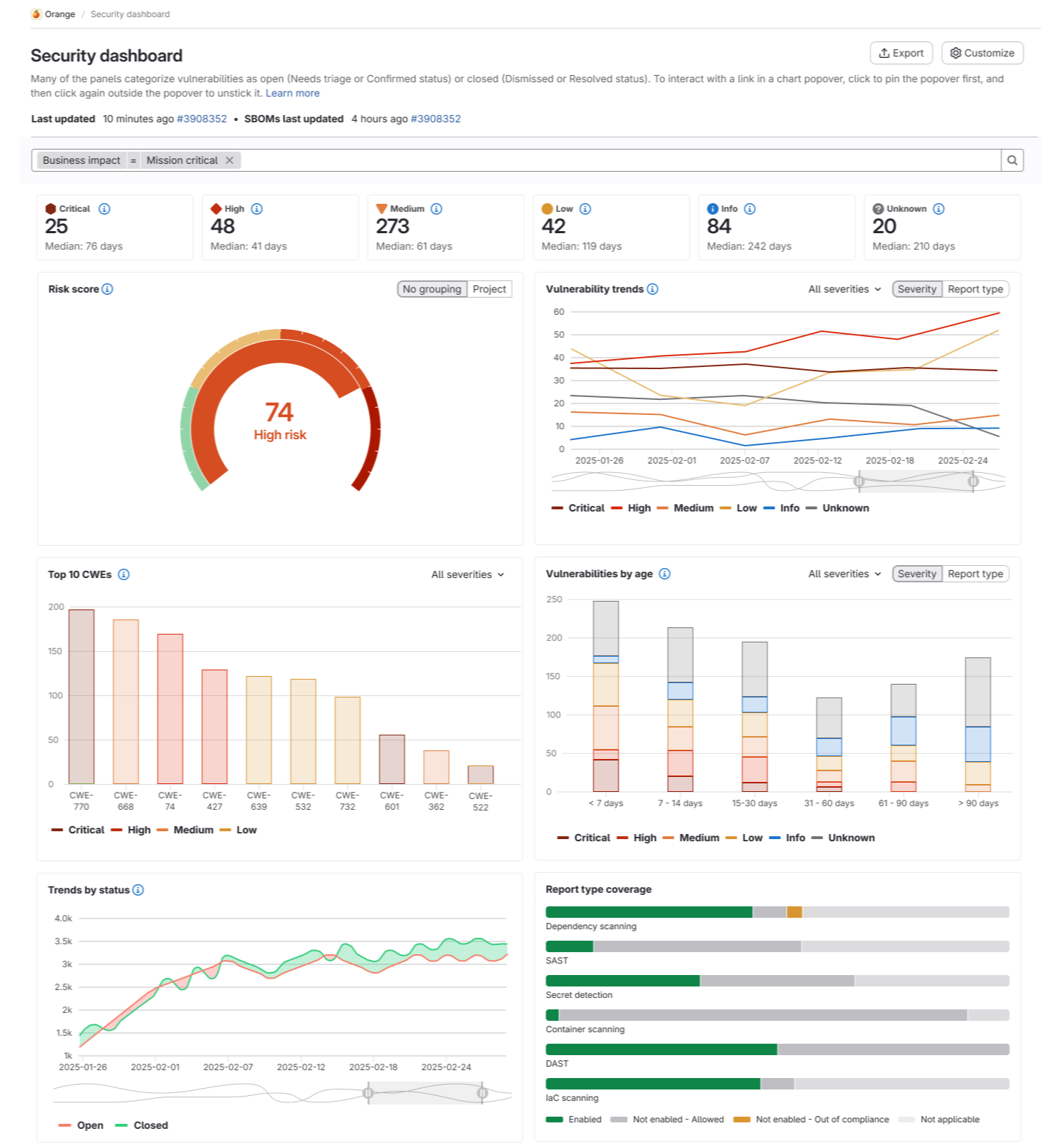
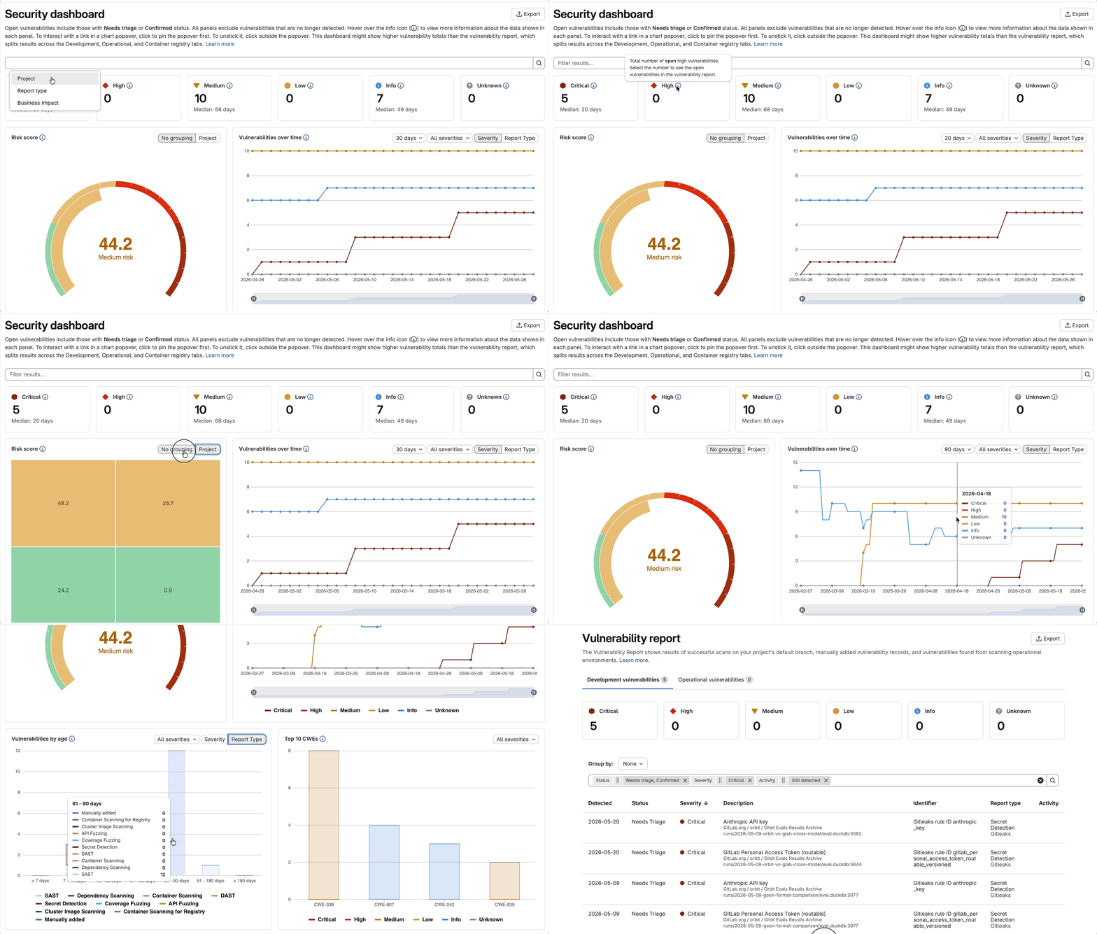
I evaluated competitive patterns and best practices when it comes to filtering, grouping, hover states, customization, and click-throughs. Then I worked with engineering to use existing Pajamas and E-Charts capabilities in order to achieve speed to delivery. For example, the gauge chart was adapted from the existing configuration, so no net-new charting dependencies were introduced. However, we also wanted to modernize our visual aesthetic, so we added custom CSS onto some of the charts so they evolved our brand style and tied to important psychological principles.
For example, the "aesthetic-usability effect" is a well-documented psychological effect that says that when something looks considered and polished, people instinctively assume the underlying system is more reliable, too. Users perceive visually cleaner interfaces as easier to use and more trustworthy, even before they've interacted with them. For security tooling specifically, this dynamic is amplified. If the surface looks noisy, inconsistent, or unrefined, it creates low-level doubt about whether the data itself is reliable. Good visual design doesn't just look nice; it reduces cognitive friction in a way that lets users extend trust to the system more readily.
I also brought engineering in early to de-risk feasibility and make implementation choices intentionally.RESEARCH
I wanted to validate early and often so I could iterate as I went. After a few initial rounds of validation, I created a walkthrough of the design demo to share with Customer Success Managers, Sales, and customers directly. Customers were excited to see new and exciting dashboard functionality on our roadmap, and several CSMs told me that demos like this could help create churn, while Sales can use them to help win deals.🍿 Watch the demo!: https://www.youtube.com/watch?v=cijGIXtMwOU
SYSTEMS
I wanted to design for a scalable framework, not one-off isolated panels. I had frequent check-ins with a fellow Product Designer on the Optimize team to define page-level and panel-level filtering, conflict handling, timestamps, and customization behavior across dashboards. It was important to connect the project to adjacent efforts so the refresh fit a larger, consistent, scalable framework and so we weren’t duplicating efforts.
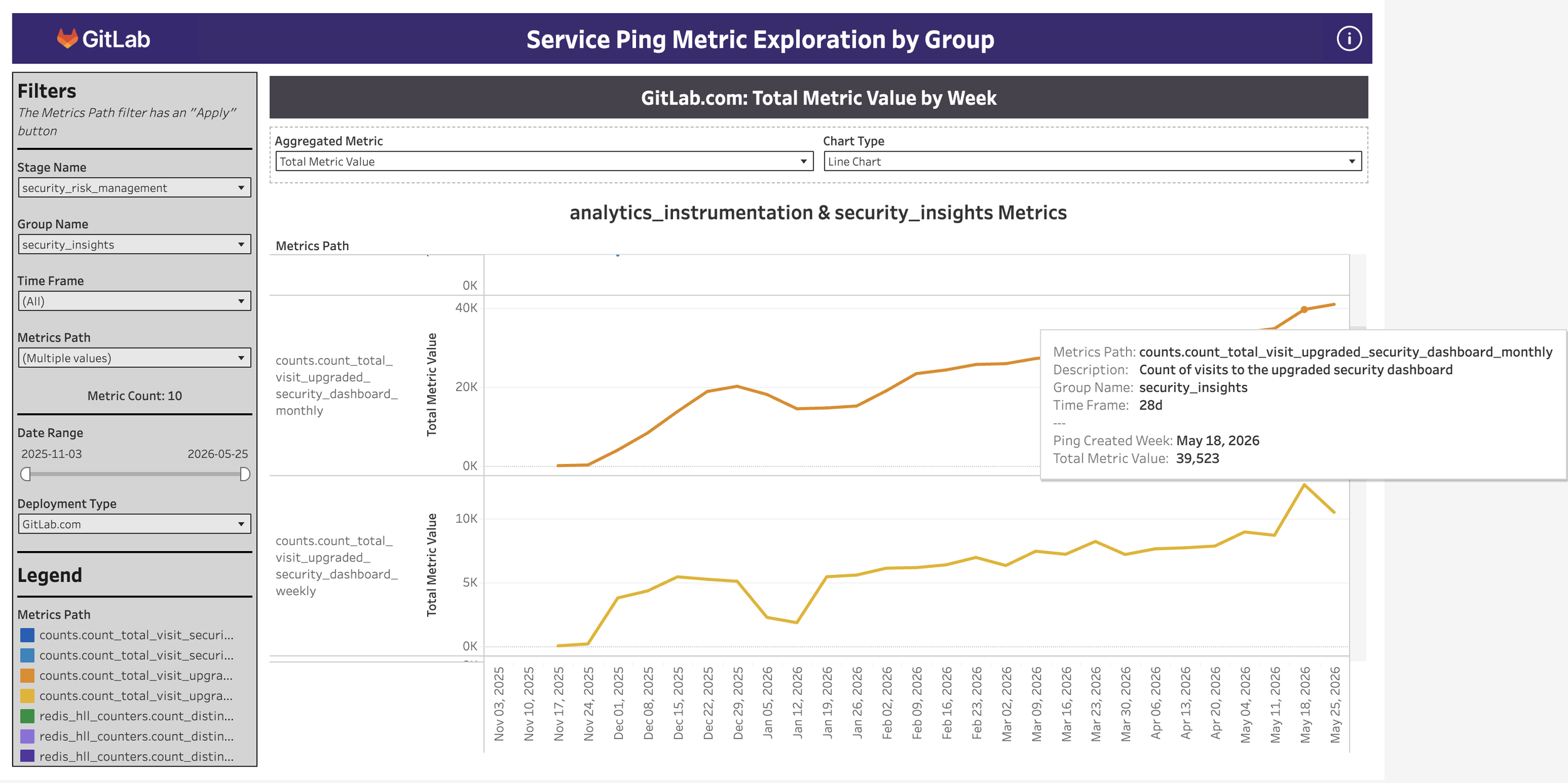
We're seeing great continuing returns on the new Security Dashboard - over 8k sessions in one week, which was 2.2x the average weekly sessions of the legacy dashboard. That’s a ~100% increase and a worthy milestone celebrated by our leadership. And we’re still growing 🎉
⚠️ Challenges
Of course, not all projects run smoothly from start to finish. The biggest challenge I encountered with the security dashboard was scope creep. One of GitLab’s values is iteration itself, in order to do the smallest thing possible and get it out as quickly as possible. That said, we’ve encountered problems when only designing MVCs (Minimum Viable Changes) because we’re not fully advocating for the user and their needs if we’re only working within the current technical constraints of the product. My design philosophy is to design the vision and work backwards from there to come up with iterations as a pathway there. However, a few times, I let design feedback stretch my brain like silly putty in all directions, which could have started to delay the design handoff to development. Once I caught the scope creep, I opened V2 and V3 work items, in order to make sure that the great ideas and considerations didn’t get lost in the original comment thread, and so that my peers leaving feedback knew that their input was valued and would be included at the appropriate time.
Following our convention over configuration product principle, we knew we wanted to offer some dashboard panels out of the box, but not have our future roadmaps held hostage to never-ending customer requests for different data configurations. A configurable dashboard was the only way to scale in the long term, so that’s our focus for V3.
Version 1 (FY27 Q2): Release 3 panels supporting primary use cases for software developers, and 3 panels supporting primary use cases for leadership. (6 total)
V2 (FY27 Q3) : Release 4 more panels supporting secondary use cases (customer need) , and encouraging AI adoption (business need).
V3 (FY27 Q4): User customization. Enable the customer to create their own dashboards and panels configured exactly how they’d like. Users should be able to create new dashboards, edit existing dashboards, have control over settings (such as permissions), and choose the saved default filters and data.
🐾 Next steps
As we’re currently in Q2, engineering is focused on V1. Design needs to stay ahead of engineering, so I’m working on V2 and V3.
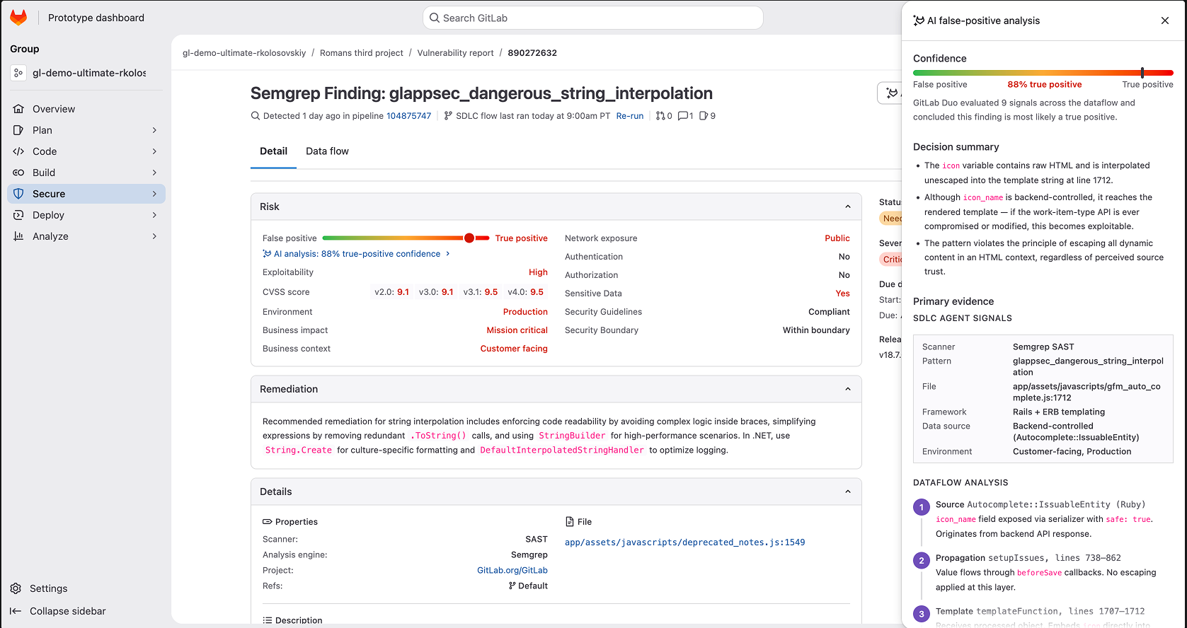
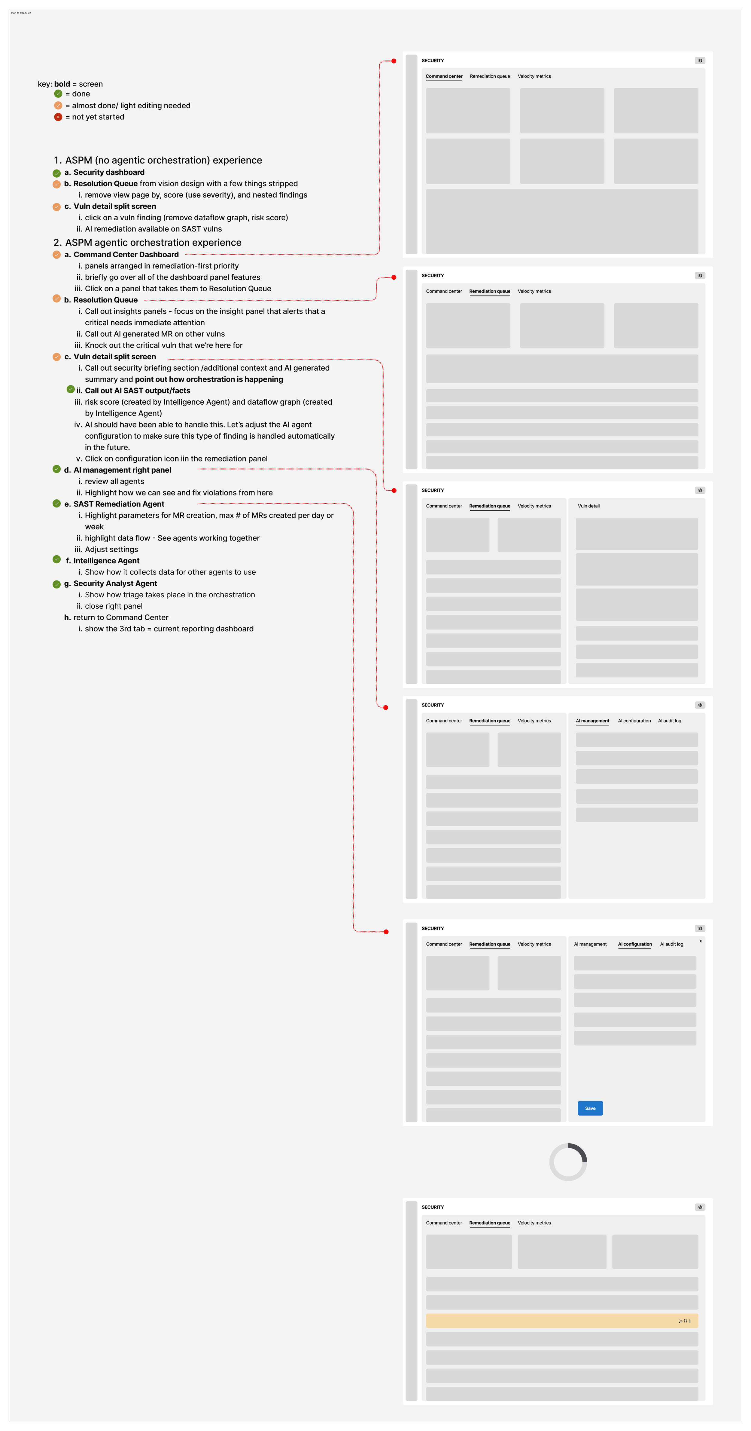
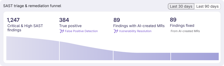
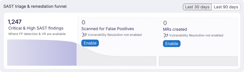
As part of V2, I just completed designs for a wave chart showing the value of our AI agent output. We’ve also been given a business goal of increasing AI agent enablement, so I also designed a state if the user doesn’t have one or either agent enabled. I’ve been collaborating async with PM and engineering and explaining my design rationale in this thread: https://gitlab.com/groups/gitlab-org/-/work_items/21703#note_3269120803.
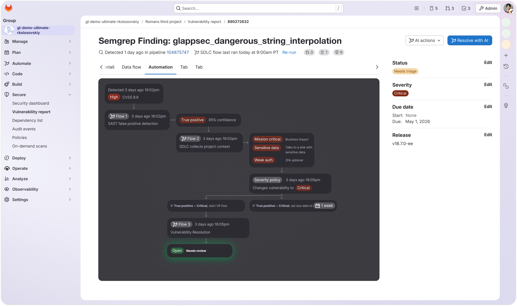
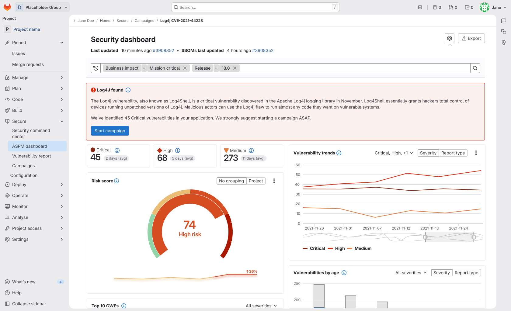
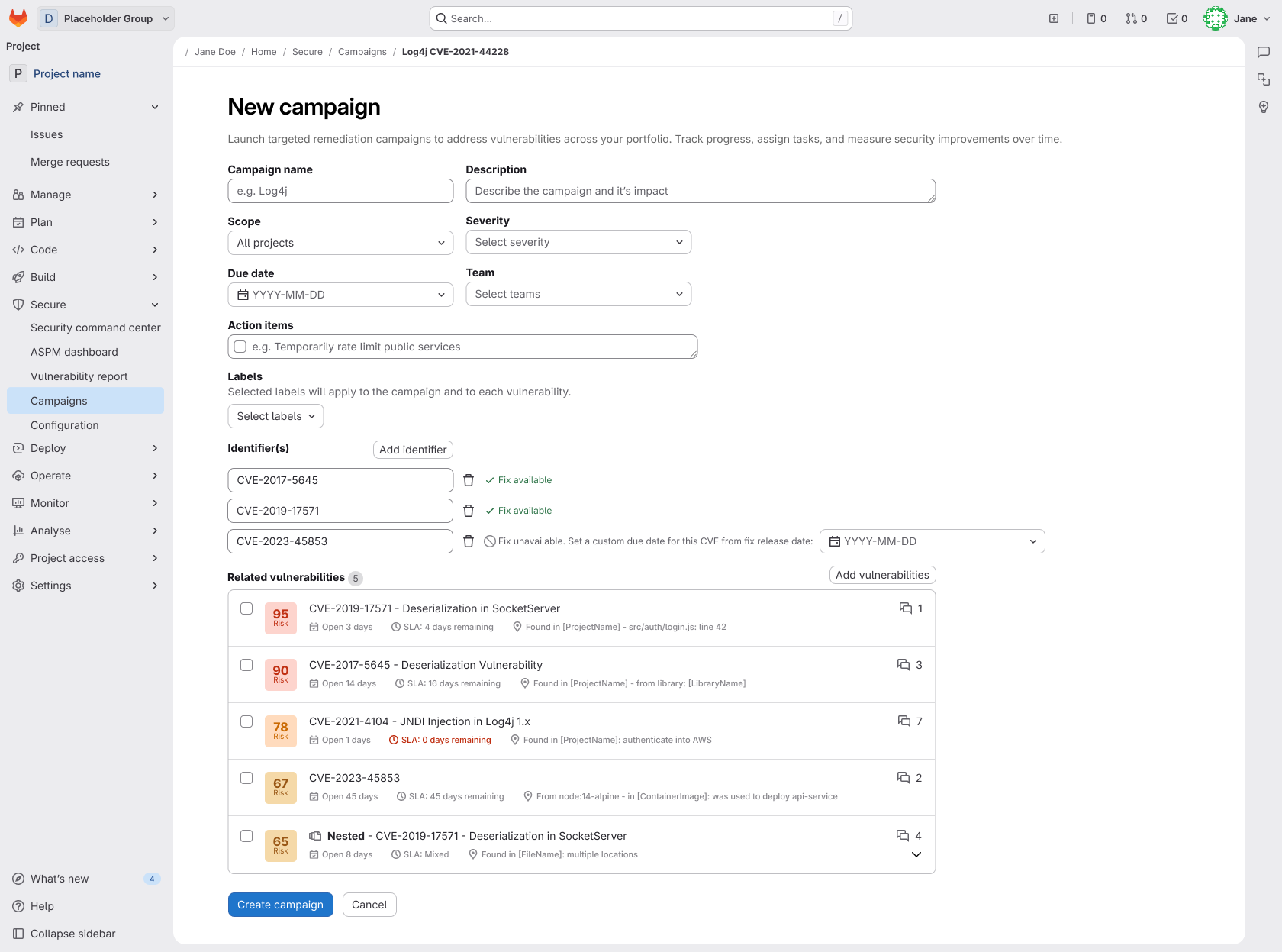
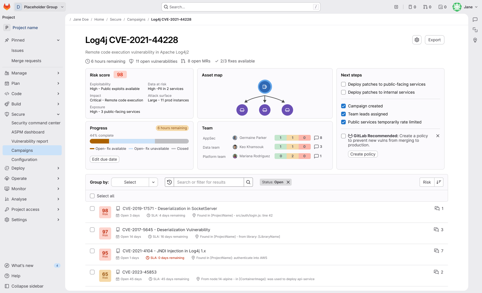
While considering workflows for the dashboard project, I identified a gap in GitLab’s offerings. If the dashboard is the go-to place to discover what security items need attention most, we need to notify users of zero-day vulnerabilities here. But it doesn’t end there: Engineering teams (or AI agents) need a place to organize the vulnerabilities and progress related to these critical items. Enter campaigns. I took initiative proposing a new concept of campaigns, where users can set due dates, add labels (for tracking and auditing), assign team members, and the system can automatically pull in related vulnerabilities through CVE identifier. A dashboard allows leads to monitor ongoing progress.
CASE STUDY 2: Strategizing work with UX ROADMAPS
UX Roadmaps are comprised of UX themes, which are bundles of work organized around the user problem, their need, and their desired outcome. UX Themes comprise a team's UX Roadmap, which should act as a single source of truth for a team's North Star UX vision, serving as the blueprint for their strategy. In essence, themes are a wrapper that looks at all the individual issues a group may have and organizes them into relational bundles, allowing solutions to be holistic and non-fragmented. A UX Roadmap is simply the prioritization of these UX Themes based on user and business needs while also considering your team's confidence in the supporting data.
In this presentation, I’ll walk you through the benefits of a UX Roadmap workshop, what we learned through piloting this initiative, and finally, I’ll share the FY25 UX Roadmap for my team at GitLab. The pilot was a collaborative effort between myself, my PM, and my design manager who facilitated the first UX Roadmap workshop back in 2021, and I’ve been creating them (alongside my PM) at the start of every year since.
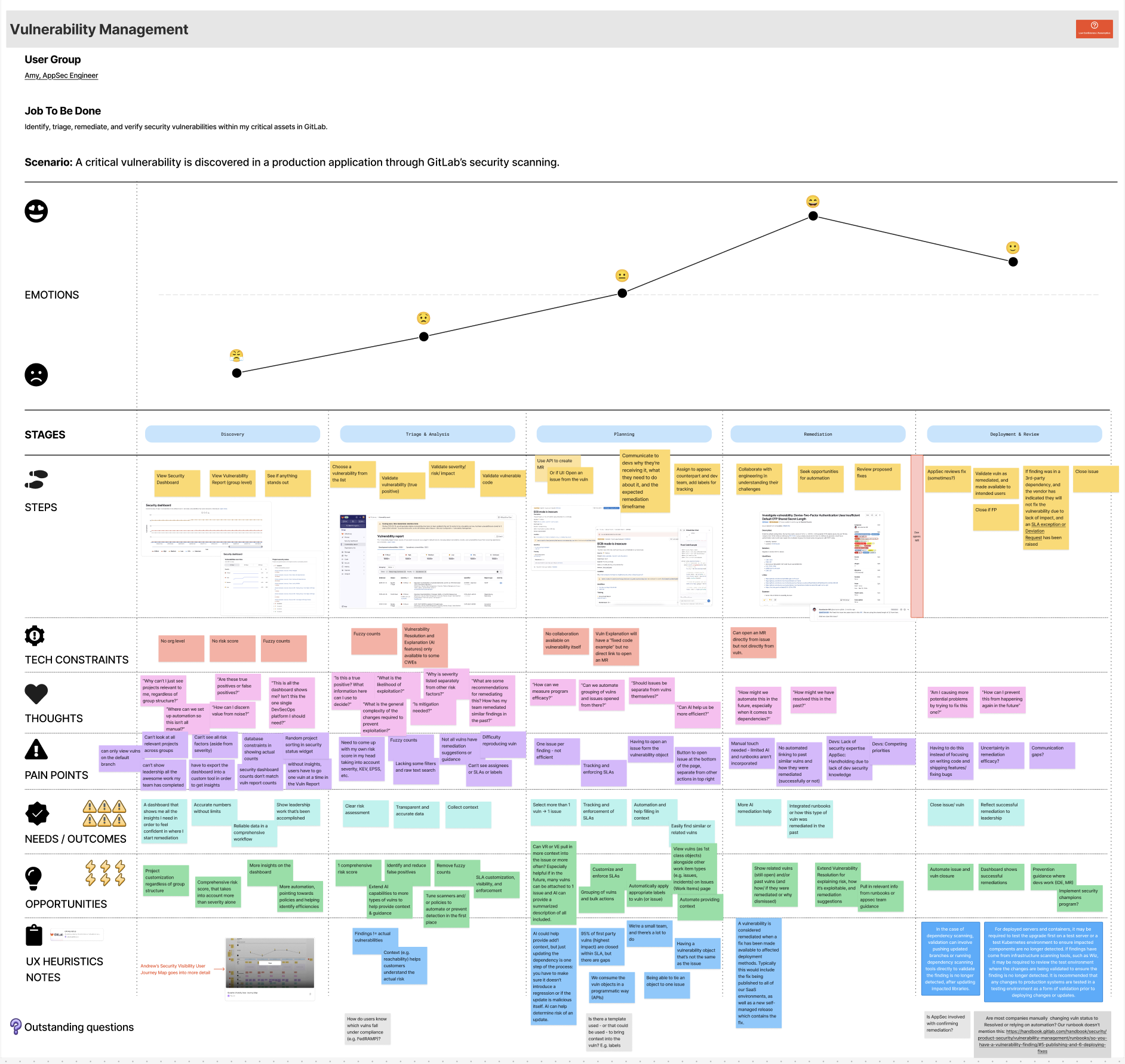
Design & research assets from various projects
I have decks that go into more detail on each of these projects. I’d be happy to walk through them upon request.